Anheuser Busch’s 2011 Susan G. Komen Race for the Cure T-shirt Design
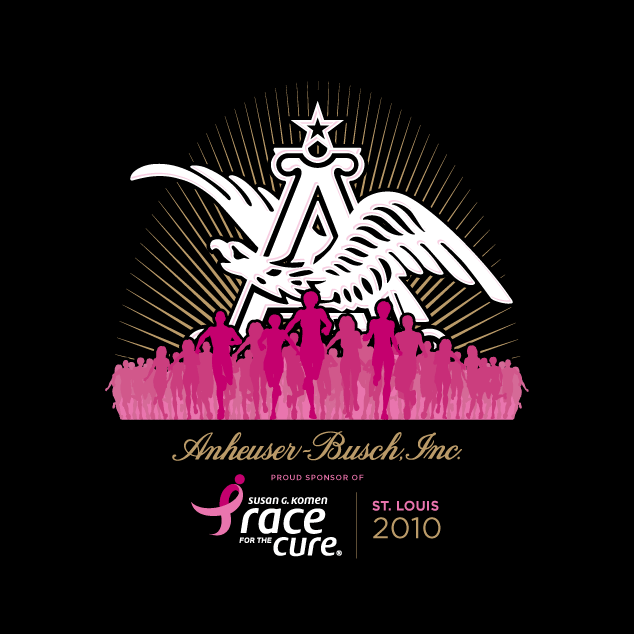
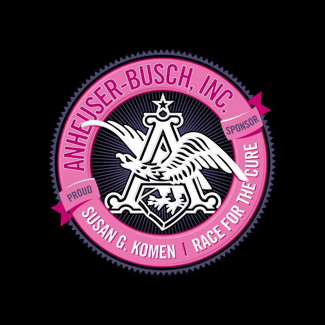
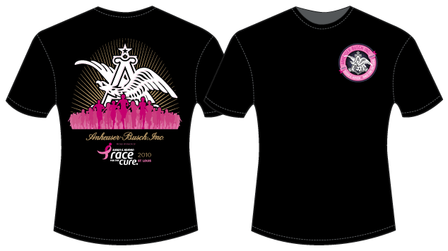
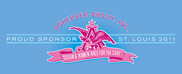
We were honored to design the t-shirts for Anheuser Busch’s (Susan G. Komen) Race for the Cure team again this year. Below is the final design, and the design below that, could not be used due to Susan G. Komen’s logo standards/guidelines, but we thought we’d show it anyway.
It’s hard to believe it’s been a year already, and if you’ve kept up with our blog since then, you would know that my mother was diagnosed with breast cancer around the same time I designed last years shirts. Since then, she has finished her chemo and radiation and is finally starting to feel “back to normal”. I feel both lucky and blessed that she is OK, and it always means a little extra when I get to design these shirts.
Look out for our shirts June 11th in St. Louis at the Susan G. Komen Race for the Cure.
Click here to read last years blog entry.
the chosen t-shirt design (close up of front)
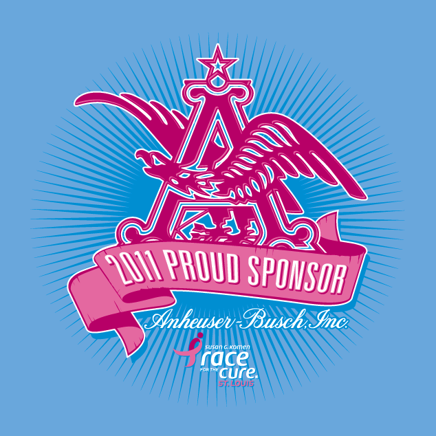
the chosen t-shirt design (close up of back)
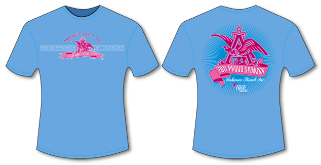
t-shirt design layout
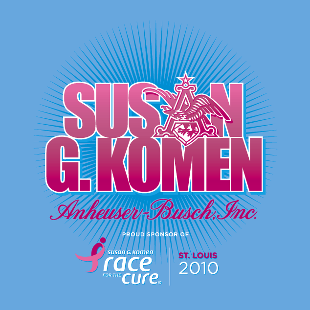
design option that could not be used due to Susan G. Komen’s logo standards/guidelines


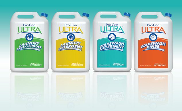
 We are both honored and privileged that a set of Visual Lure’s package designs were recently selected to be published in the upcoming book “The Big Book of Packaging”, published by Cresent Hill Books. Cresent Hill Books also publishes the popular “The Big Book of Logos” series. The package designs that will be featured are Intercon Chemical’s line of Pro-Con Ultra detergents and rinses. Intercon Chemical is a St. Louis, MO based company that manufactures industrial cleaning supplies. A special thanks to Projects PLUS and Jennifer Hojnacki for teaming up with Visual Lure on this project. Here are the original package designs (final colors were altered):