Logo Design for Toledo, Ohio Railroad Company
 Visual Lure was recently contracted to design a logo for Midwest Terminals of Toledo Inc., a railroad company located in the Toledo, Ohio area. They had an existing company with its own logo and needed a new logo for a newly established one, both with the same name except one ended in International and the new one in Inc. They wanted the new logo design to complement the existing logo, but establish a clear division between the two companies. They did not want the two logos to resemble each other at all.
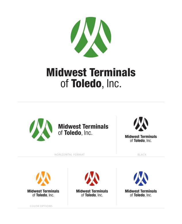
In order to have the logos “resemble each other, yet look nothing alike” we decided to create an icon like the International logo but instead of using a triangle, or any other shape with hard edges, we decided to design within a circle. Next we created the letter M, for Midwest, using railroad tracks and added shadows to give the logo more interest and depth. We also wrapped the text to two lines instead of one to give it better balance. For the initial color options we chose colors that complemented the blue in the International logo.

initial logo design with sample formats and color options
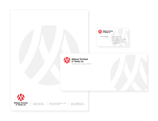
Here is the final logo in one of our proposed identity designs:

final logo design and identity package
Learn more about our logo design services and don’t forget to check out our logo design portfolio.


