OUR BLOG

Here you will find our latest works, company news and more. We update it on a regular basis so be sure to come back soon. Please like, share, pin or tweet the post you enjoy.

Logo & Packaging for New Healthy Dog Snacks Brand

Posted on June 11, 2024

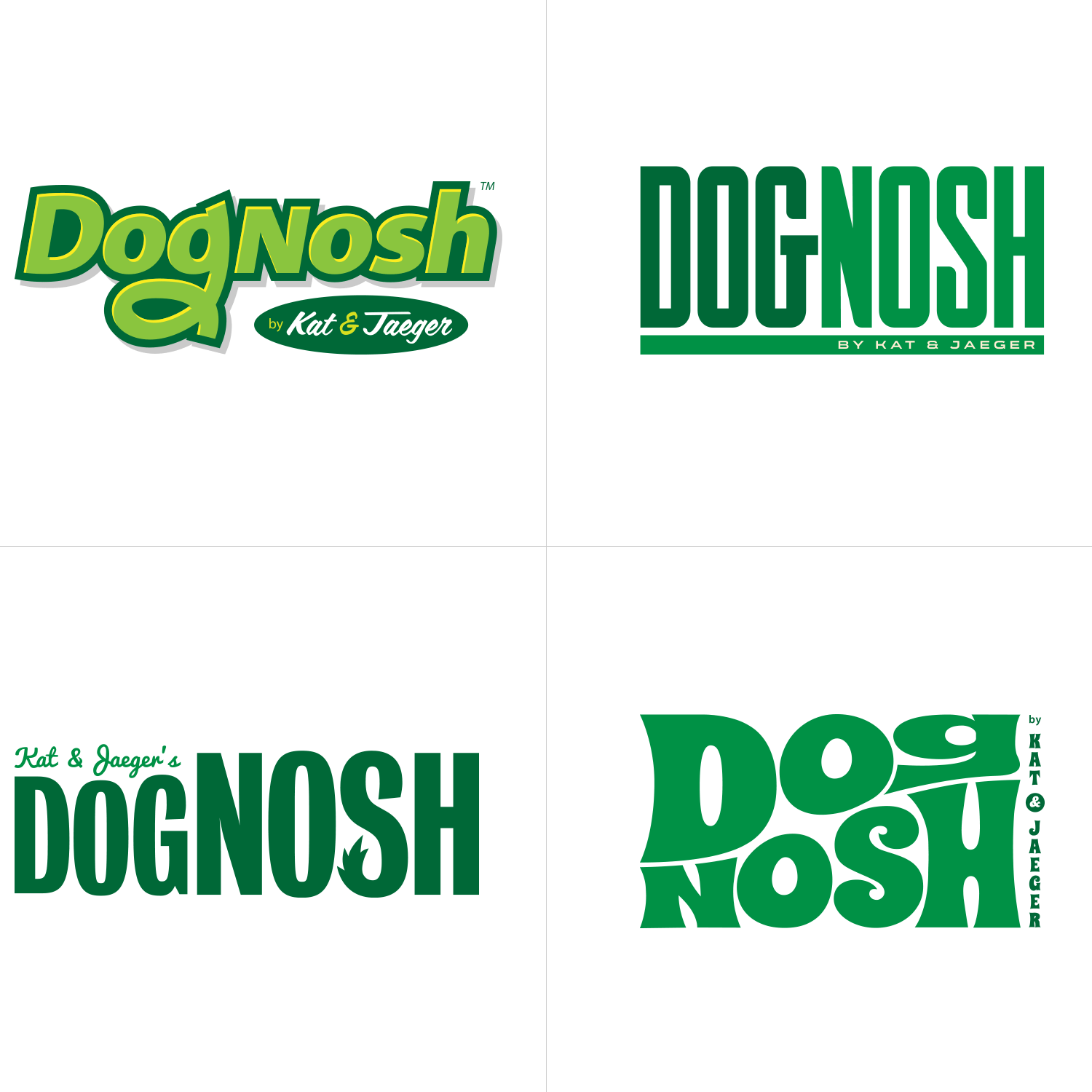
DogNosh, an emerging pet brand specializing in dog snacks, enlisted Visual Lure for the development of their new logo and packaging design. As a brand focused on promoting canine health, they expressed a preference for the color green and sought a modern and refreshing aesthetic. Below, we present our initial logo concepts, followed by corresponding packaging designs.

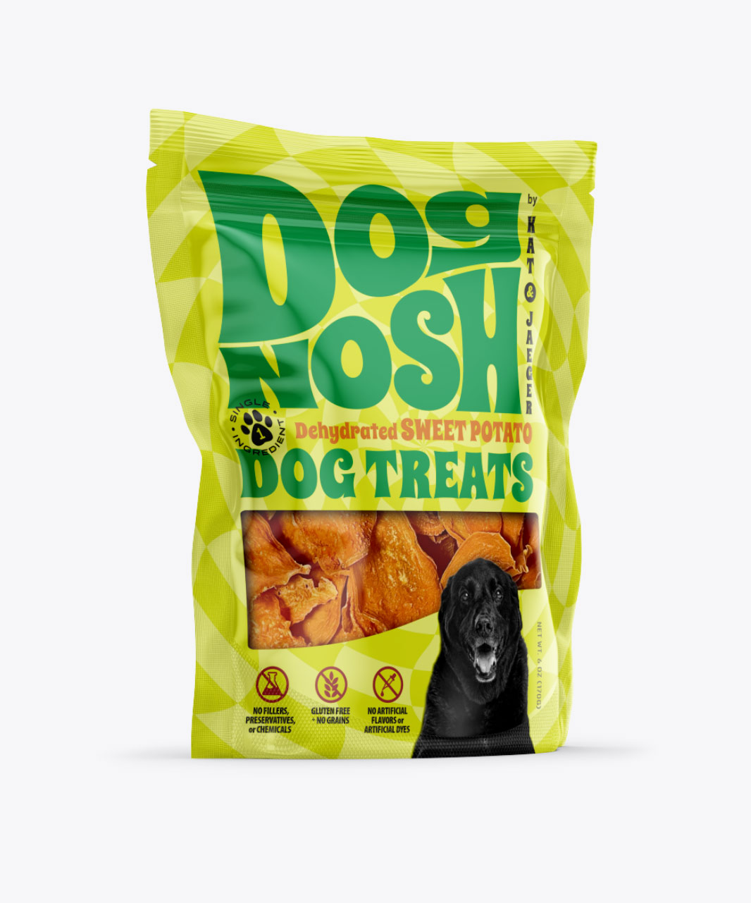
In the top left corner, we present a logotype featuring a custom hand-drawn ‘g’, subtly incorporating a hidden dog face within the ‘og’ combination. The custom ‘g’ in the logo provides a sense of fun and uniqueness, contributing to its memorability.

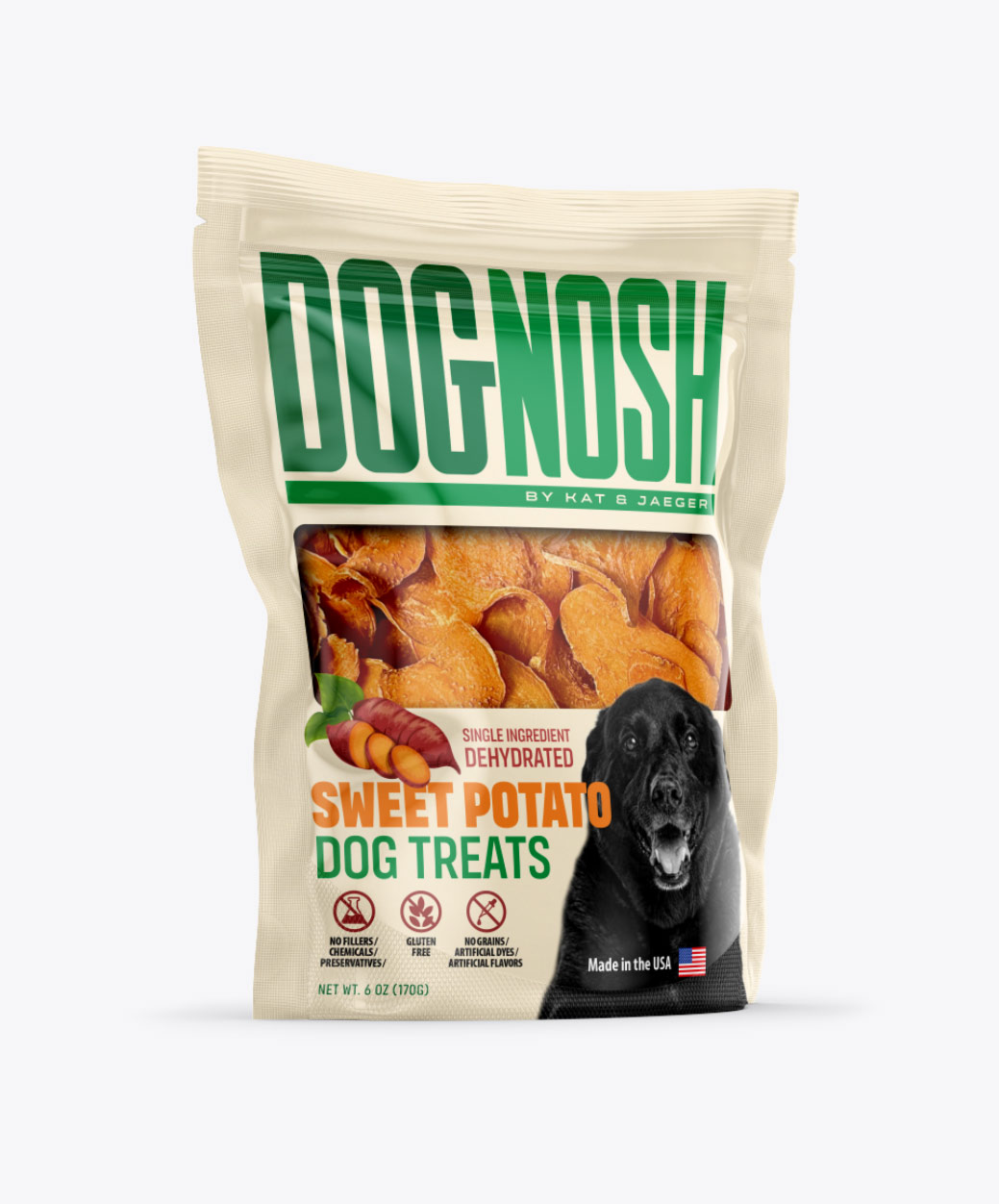
In the top right corner, we explore a modern condensed logotype, with customized lettering and curved edges strategically placed for added visual interest.

For a touch of playfulness, we developed a logotype in the bottom left corner, where we integrated a dog tail into the letter ‘S’. This whimsical element adds charm while maintaining the brand’s essence.

Lastly, we ventured into more unconventional territory with a design aimed at disrupting the typical visual landscape of dog snack packaging. This concept pushes boundaries to ensure maximum visibility and shelf impact, setting DogNosh apart from mainstream competitors.


Logo design options for healthy dog snacks

Packaging Design Options:

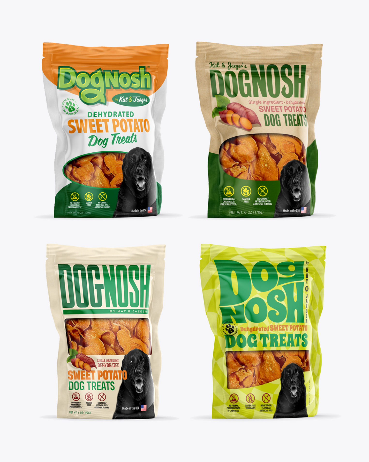
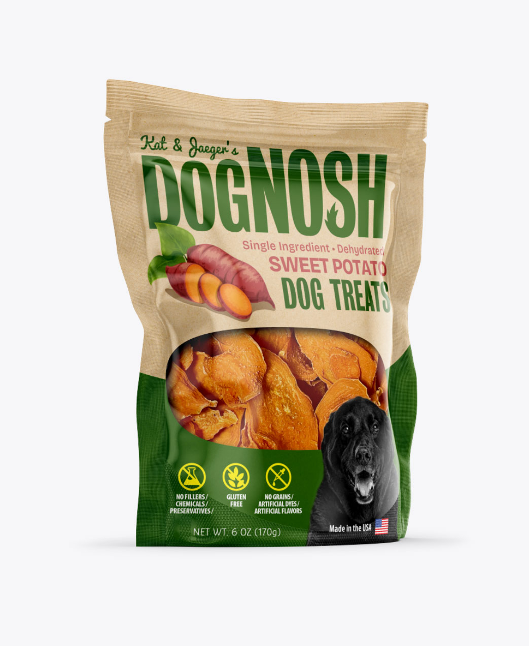
Following the logo exploration phase, we delved into designing packaging options tailored to each prospective logo. This process allowed us to visualize how each logo would translate onto packaging, ensuring coherence and resonance with DogNosh’s brand identity.

DogNosh packaging design all

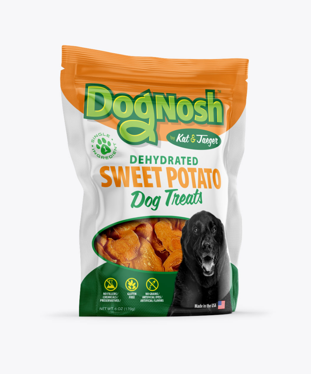
Packaging Option 1:

DogNosh packaging design option 1

Packaging Option 2:

DogNosh packaging design option 2

Packaging Option 3:

DogNosh packaging design option 3

Packaging Option 4:

DogNosh packaging design option 4

More to come…

Dognash is gearing up to launch four new exciting products in total! Stay tuned to discover which packaging they’ve selected for the first product, and keep an eye out for the unique designs of the remaining three packages.


Need expert branding and package design services?

If you’re on the brink of launching a new product and require expert branding and package design services, look no further than Visual Lure. Contact us today for a FREE quote. Don’t gamble with subpar or novice designers. Ensure your product makes a lasting impression from the start, preventing potential rejections from buyers due to lackluster presentation.

For further insights into our packaging services, explore:

Logo Design for St. Louis Area Photography Company

Posted on May 2, 2011

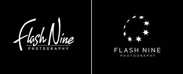
Visual Lure was recently contracted to design a logo for a St. Louis Metro East photography company.ย  During our initial design consultation they asked for some type of hand scripted font. With this direction, we came up with the logo on the left.ย  We believe it is unique, personable and friendly, which we feel is perfect for a photography business.ย  This was the final logo they ended up going with.ย  The “nine flashes” logo on the right was another option we came up with while brainstorming/sketching.ย  It was not chosen, but we figured we’d show it anyway, for those who like to see some of our other solutions.

St. Louis photography logo design options

logo design options

Learn more about our logo design services and don’t forget to check out our logo design portfolio.

Logo Design for a St. Louis MO Donut Shop & Cafรฉ

Posted on September 16, 2010

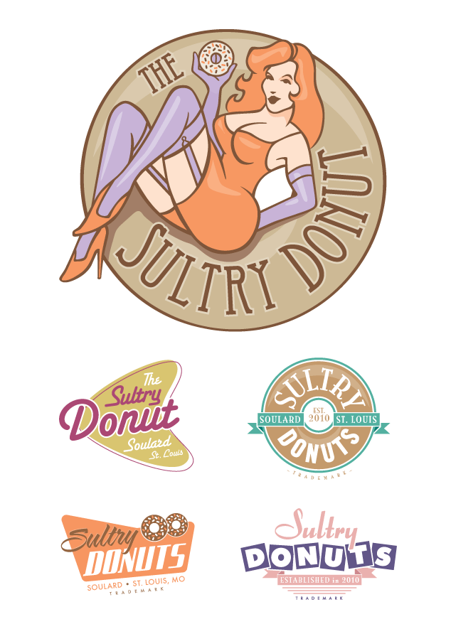
The Sultry Donut, a donut shop and cafรฉ coming to Soulard, engaged Visual Lure to design it new logo.ย  They wanted the new logo design to have a vintage look and feel, since their plan is to have a classic cafรฉ atmosphere with pinup style waitresses. So we used muted colors, vintage motifs and retro looking fonts to fulfill the clients wishes.ย  The logos below are what we came up with.ย  The chosen logo design is the large one on the top with the red headed pinup girl.

Sultry Donut Logo Design

Sultry Donut Logo Design

Nidacast Logo Design

Posted on March 25, 2010

Visual Lure is in the process of designing a logo for Nidacast, a St. Louis, MO based eCommerce company that will be selling guns, supplies, accessories and more.ย  We are also designing a fully customized eCommerce website.ย  Here are a couple of the logos we recently provided them.ย  Check back soon for the final logo design and the new website.

Proposed Nidacast Logo Design Options

Proposed Nidacast Logo Design Options


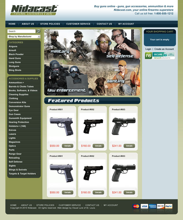
Update: Here is our proposed homepage design for the website:

Nidacast web design St. Louis

Helping a Non-For-Profit Organization With Its Logo

Posted on April 17, 2009

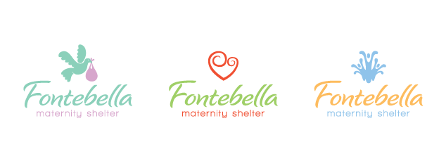
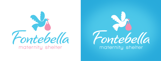
Here are a couple logo design options I just provided to Fontebella, a faith based non-for-profit maternity shelter coming to the Belleville and O’Fallon, IL area.ย  The logo on the left plays off the “stork” baby theme, but replacing the stork is a dove, symbolizing God’s gift of life. The logo in the middle is a heart which creates two symbolized heads, representing the mother and child, or the mother and a member of the shelter helping and supporting them. The logo on the right represents a fountain with life springing from it. (fonte means fountain and bella means beautiful)

fontebella12

The client decided to go with the following logo and color option.

fontebella2

Want to see more of our logo designs?ย  Click here to check out our full logo design portfolio.