OUR BLOG

Here you will find our latest works, company news and more. We update it on a regular basis so be sure to come back soon. Please like, share, pin or tweet the post you enjoy.

Cleaning Up & Fixing a Logo to One of My Favorite Restaurants

Posted on April 29, 2024

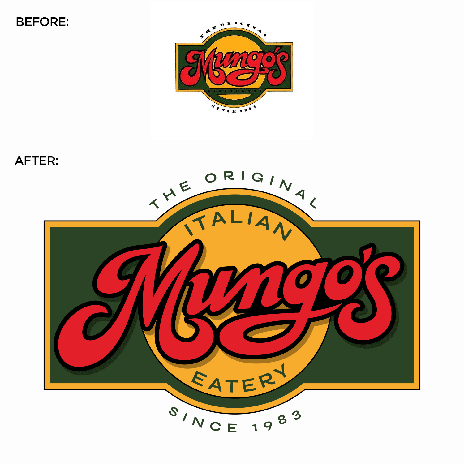
Mungo’s Italian Eatery, located in Collinsville, Illinois, is one of my family’s favorite restaurants. My wife and I have been patrons since the mid-1990s, and their logo has always bothered me. It appears as though it was cut out with scissors, with messy proportions, inconsistent letter thickness, and improper sizing. So, I took it upon myself to meticulously redraw and refine every aspect by hand.

Here is the before & after:
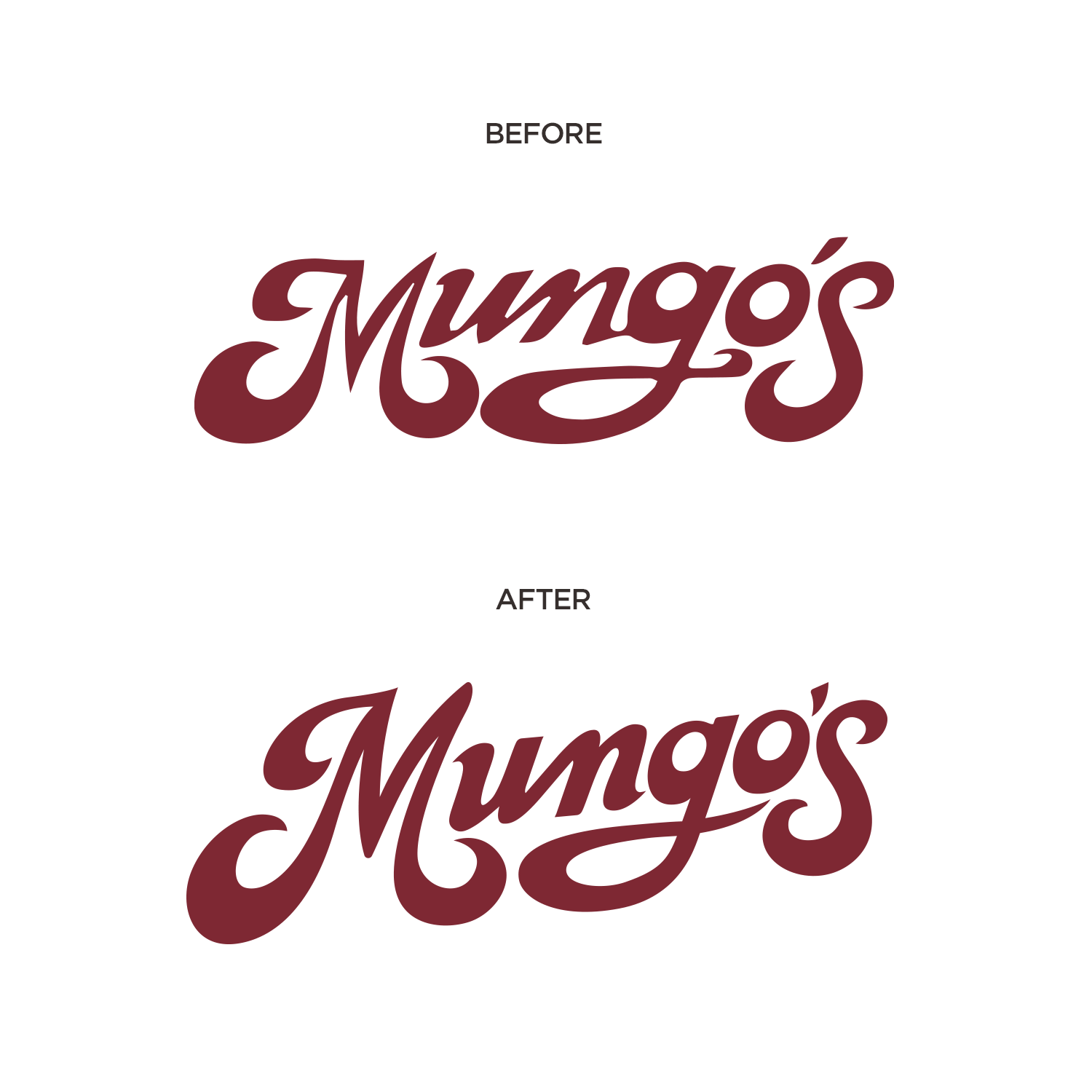
mungos-logo-before-after

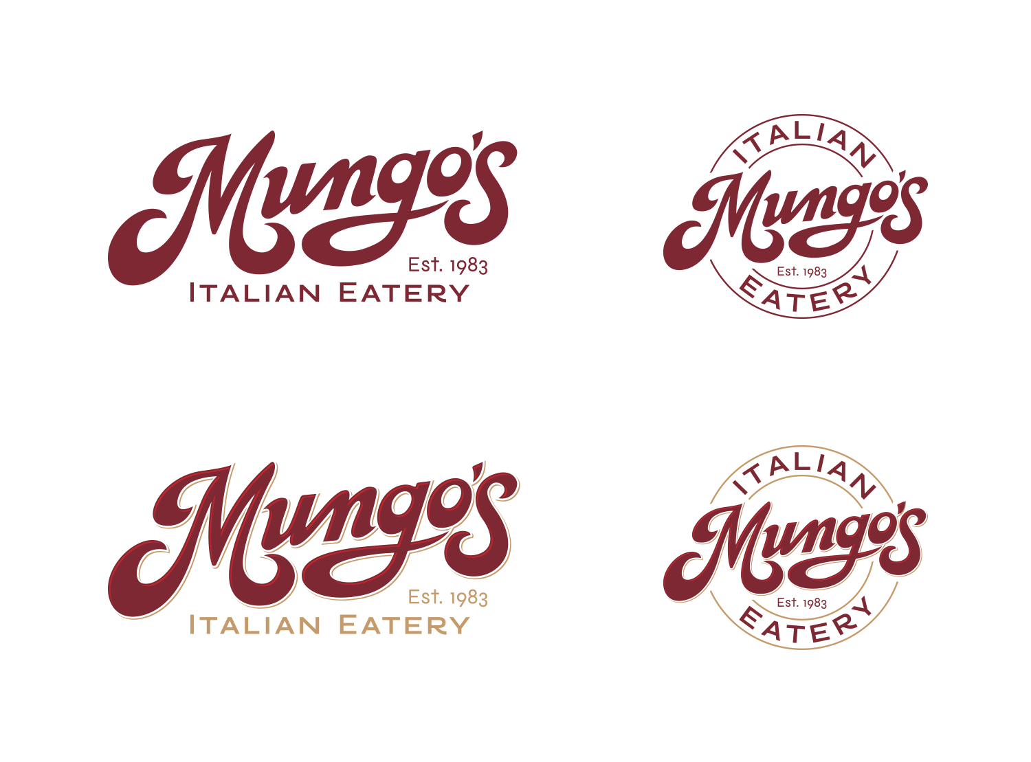
…and here are some lockups:

mungos-logo-lockups

mungos logo before after 2

…and here are a couple mockups:

mungos-logo-glassย  mungos-logo-apron

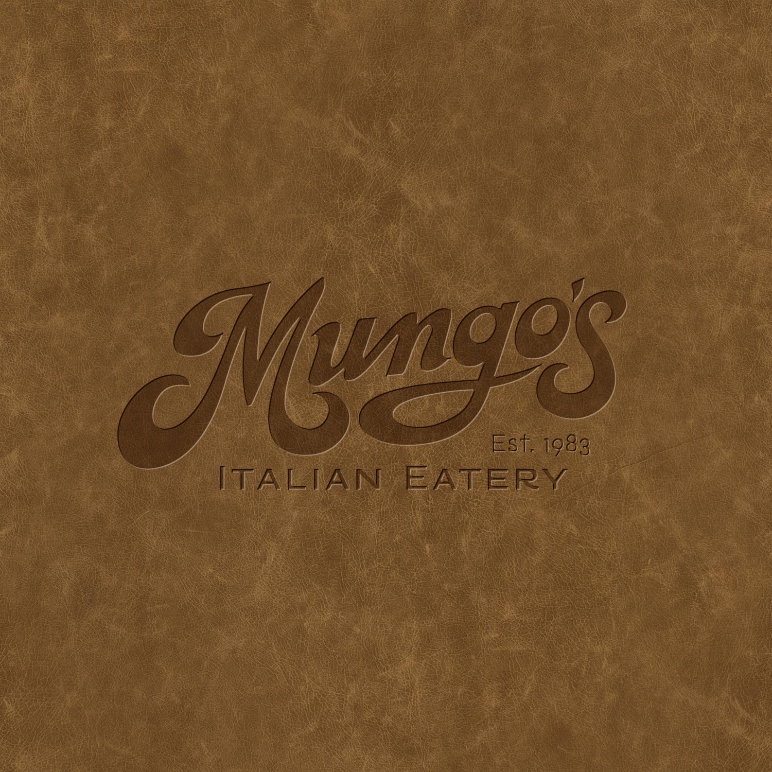
embossed-leather mungos logo

Needs a logo spruced up?

Does your logo have current brand equity, but it doesn’t look great and lacks visual appeal? Does your logo simply need to be cleaned up, refined, or slightly modernized? If so, we can help. Shoot us an email or give us a call today – as we would love to help.

Logo Upgrade for Local Medical Aesthetics Office

Posted on April 21, 2022

Not all the logo and branding work we do starts from scratch. Sometimes we are brought in – to simply update, tweak, or adjust a logo – which was the case here.

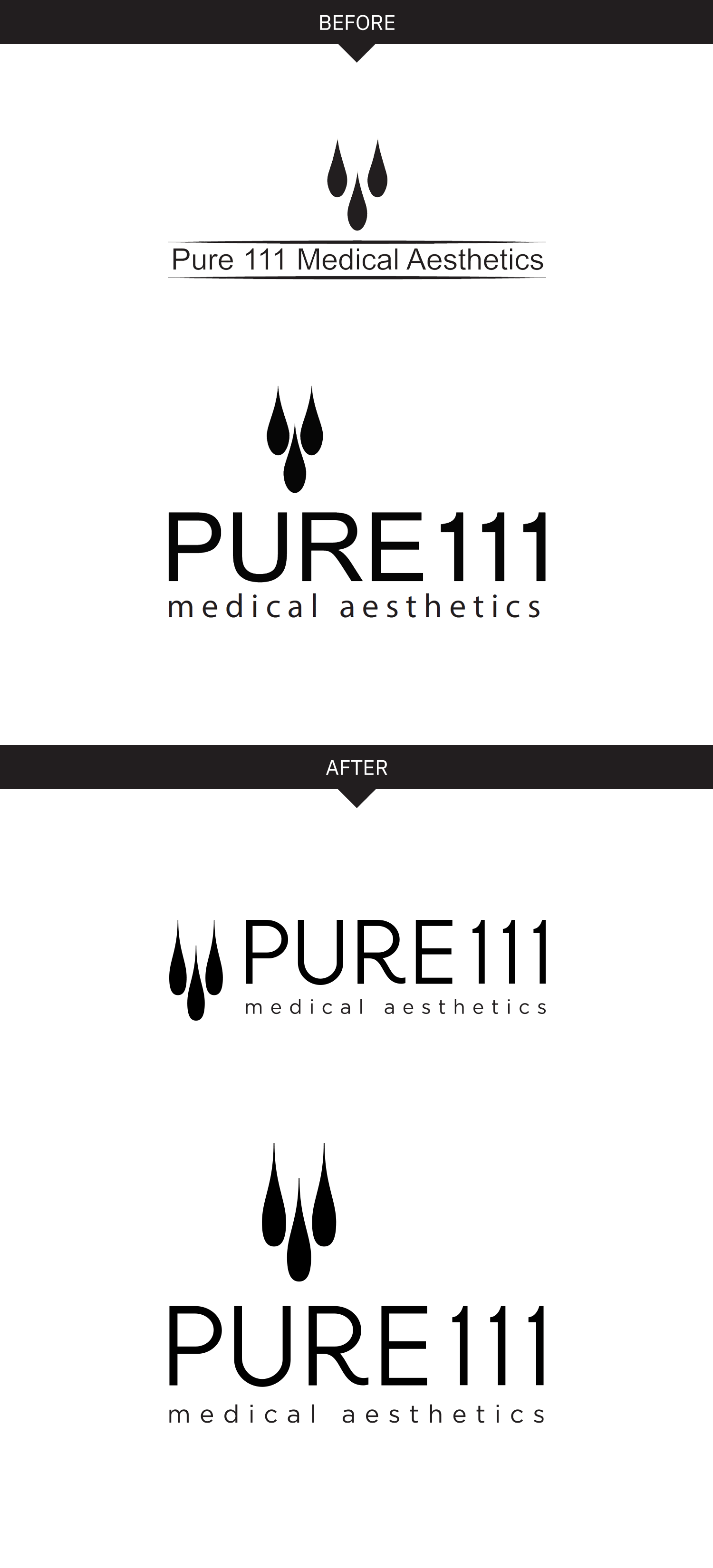
Pure 111 was moving offices and wanted to fine tune their logo for their new building signage. When we reviewed their existing logos we noticed there were different icons being used (see the “before” below), and their horizontal and vertical logo options felt disconnected – both because of the different icons, but also because of the different typefaces being used. The logotype also felt generic and unrefined.

Our solutions was to polish up the icon, and update the type. We created a custom R which still felt super modern, but gave the logotype a touch of femininity. It also made it look more custom, and not so “out of the box”. We slightly lightened the type too – which made it feel a little more refined and stylish. Their new offices and signage turned out great!


Pure 111 Logo: Before & After

SIGNAGE

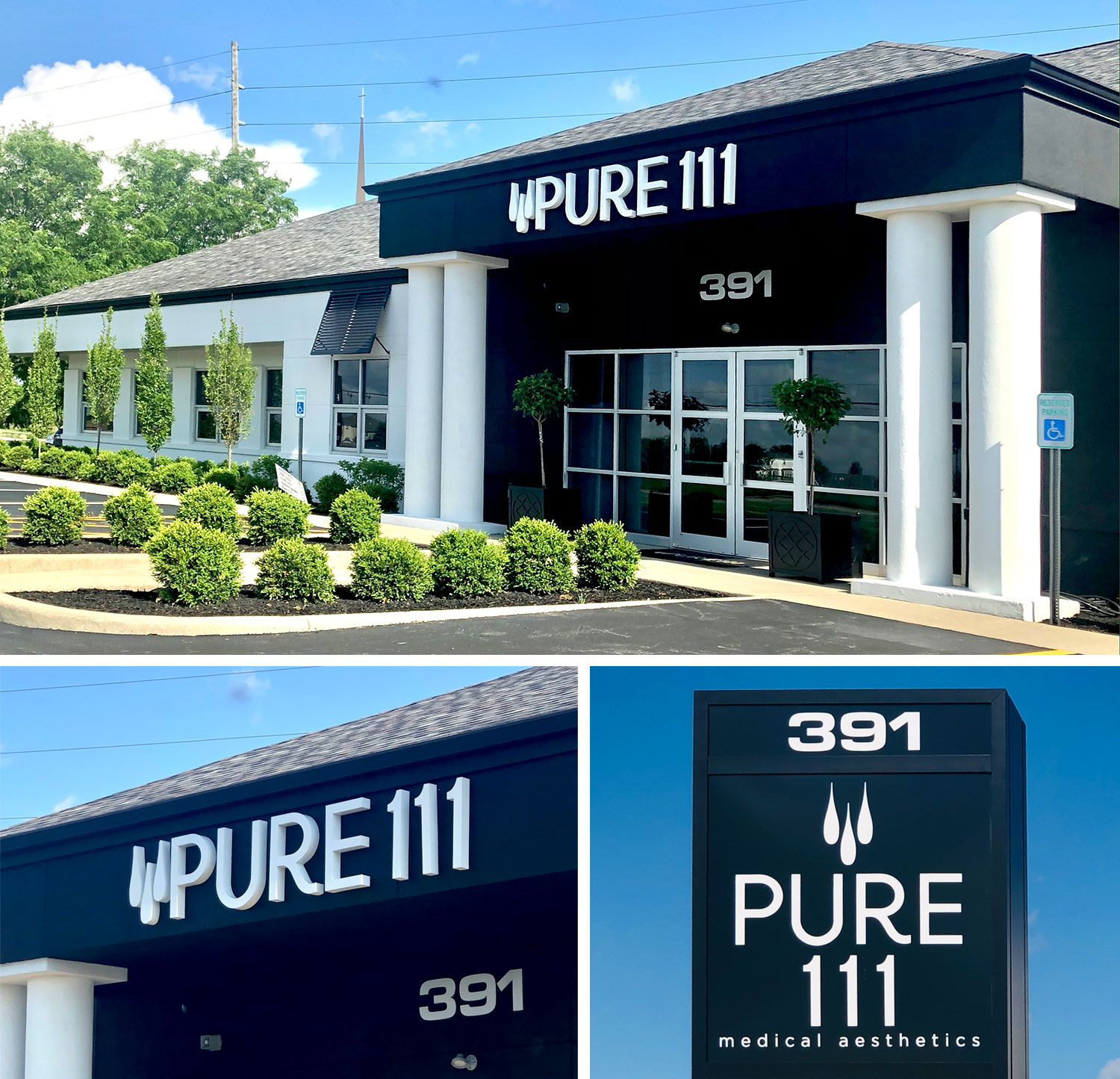
New signage looking sharp too:

pure-111-signage


Do you have an existing logo that looks dated or unrefined but youโ€™re hesitant to explore a complete redesign because you feel it has too much brand equity or brand recognition? Or maybe you just need an existing logo converted into vector artwork with different formats. Either way, Visual Lure can help. Take a look at some of our sample logo refreshes and contact us today for a free logo upgrade quote!