Visual Lure’s Latest Design Work Photographed
Posted on May 19, 2010 by JUSTEN HONGVisual Lure recently had some of its latest design projects photographed (and a couple archived ones from a while back). Please select a portfolio to view more:

Here you will find our latest works, company news and more. We update it on a regular basis so be sure to come back soon. Please like, share, pin or tweet the post you enjoy.
Once again, international award winning photographer and author, Salvatore Cincotta has turned to Visual Lure for logo design, branding and website design & development. After numerous successful speaking events and a couple book deals, Sal is entering the photography consulting business with a boom. His consulting company is called “The Business Behind the Shutter”, which we assisted in naming. The website will be www.BehindTheShutter.com. We will post a link when the website goes live. Here is a sneak peek at the new website.
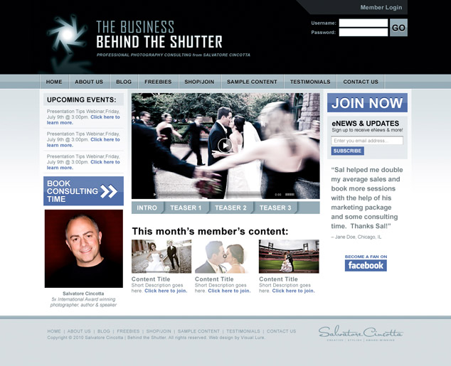
BehindTheShutter.com web design
Visual Lure recently completed the new Woodlands Photography website. Below are a couple of screen shots of the new design.
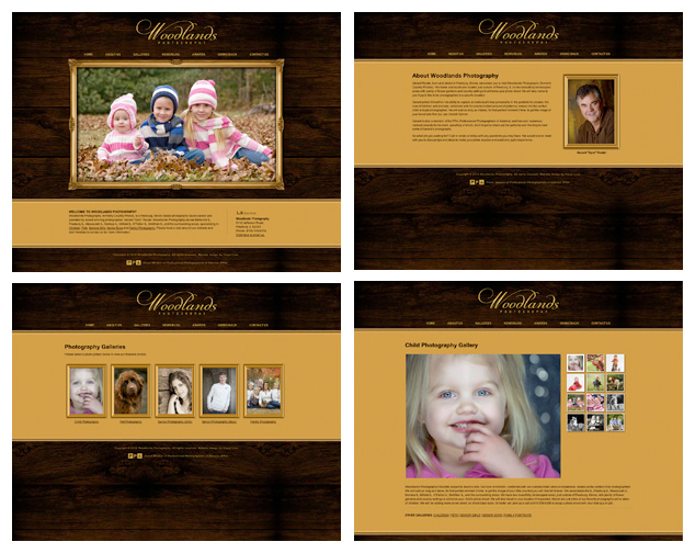
Woodlands Photography Website Design
Woodlands Photography is a Freeburg, IL based photography studio with Gerard Reuter, an award winning photographer, at its helm. He specializes in children photography, pet photography, senior photos and family portraits. He servers the St. Louis Metro East area including Belleville IL, Freeburg IL, Mascoutah IL, Marissa IL, Millstat IL, O’Fallon IL, Smithton IL, and the surrounding areas.
View our St. Louis Metro East/St. Louis website design portfolio.
Visual Lure was recently contracted by Anheuser-Busch to design their t-shirts for the 2010 St. Louis Susan G. Komen Race for the Cure. We were honored to design this years shirts for such a great company and such a great cause.
On a personal note, my mother was recently diagnosed with breast cancer just before Thanksgiving last year. They caught it early so she will be one of the lucky ones. She is currently going though chemo and is in good spirits with minimal side effects. We have been both lucky and blessed. Without the support of my mother, I don’t know what I’d be doing. She was the one who encouraged me to pursue art. As a child, my mother would always carry pencils, a box of crayons and paper in her purse for me. She provided me with enough blocks to build cities in the living room, and she always signed me up for art classes. So thanks to her, I am doing what I love for a living. Thanks Mom!
Here are the two initial design options we provided AB. I will post the final design once it has been approved. Oh ya, and please support Susan G. Komen for the Cure.
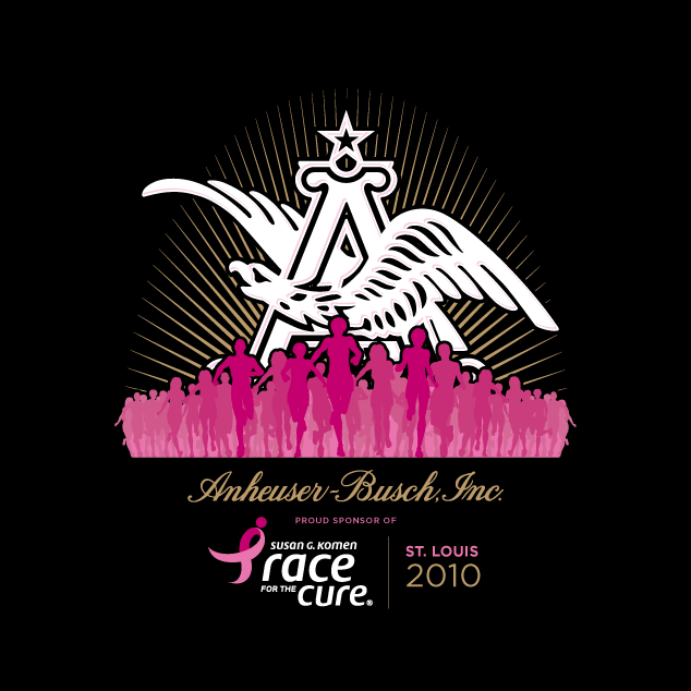
Anheuser-Busch Susan G. Komen Race for the Cure T-shirt design option 1
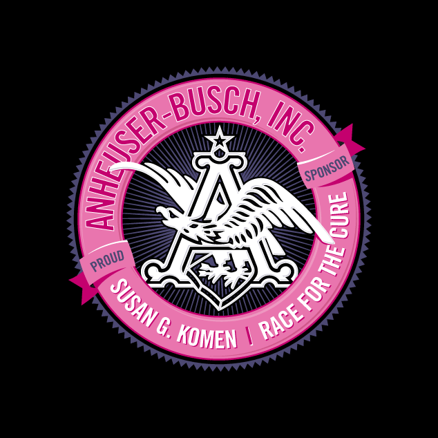
Anheuser-Busch Susan G. Komen Race for the Cure T-shirt design option 2
and the winner is:
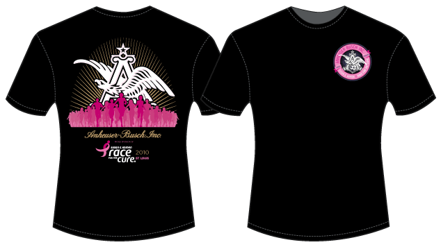
Final AB/Komen T-shirt Design
Anheuser-Busch liked both designs so much, we ended up using both of them, one on each side. Be on the lookout for them Saturday, June 12, 2010 in St. Louis.
With the rebrand of Woodlands Photography, they were wanting to target pet photography, so here is a business/promo card we designed. They wanted it to stand out and be in the shape of a dog bone.
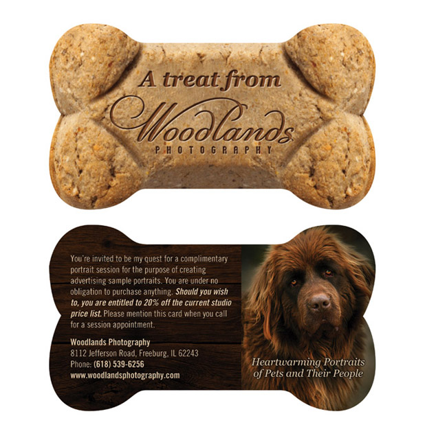
Woodlands Photography Pet Promo Card
Well after we received print quotes, the custom diecut business cards took us over budget, so we had to alter the design. Here are the final cards photographed:
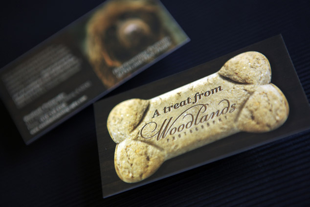
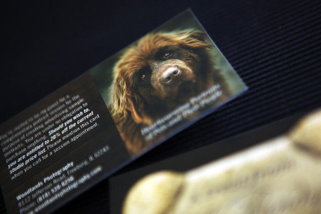
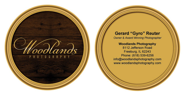
Woodlands Photography Business Cards
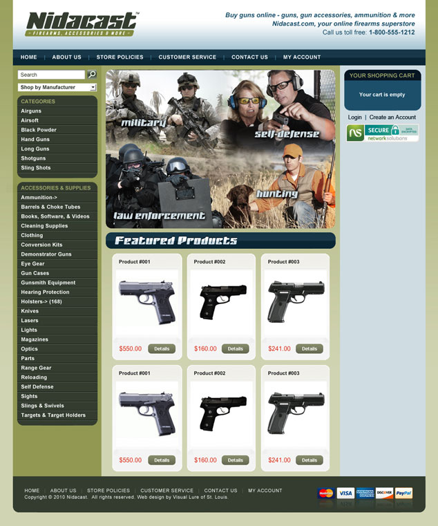
Visual Lure is in the process of designing a logo for Nidacast, a St. Louis, MO based eCommerce company that will be selling guns, supplies, accessories and more. We are also designing a fully customized eCommerce website. Here are a couple of the logos we recently provided them. Check back soon for the final logo design and the new website.

Proposed Nidacast Logo Design Options
Update: Here is our proposed homepage design for the website:
Once again Salvatore Cincotta Photography has turned to Visual Lure for logo design and branding services. Sal has been speaking nationally about the business of photography with great success and is now venturing into photography education and consulting. Besides logo design services, we also assisted in naming. Our other favorite name was Photology, the art and science of the photography business, but the domain name was already taken (Sal wanted the domain name to match the company name). Be on the lookout for BehindTheShutter.com, and here is the new logo to hold you over ’til then:
The Business Behind the Shutter Logo Design