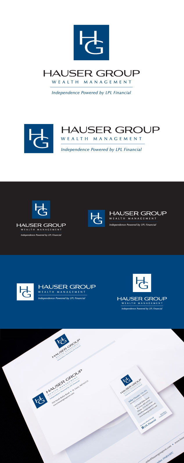
OUR BLOG

Here you will find our latest works, company news and more. We update it on a regular basis so be sure to come back soon. Please like, share, pin or tweet the post you enjoy.

Second Logo for the Flower Mountain Family of Companies

Posted on July 10, 2014

We recently completed a new logo for Flower Mountain Weddings & Receptions, a Smoky Mountain wedding venue located in Sevierville, Tennessee. Using the same woodcut illustration style that we used to create Flower Mountain, we recently completed the new logo for its sister venue, Abiding Grace Chapel on the Creek.

Abiding Grace is located in Gatlinburg, TN and provides an all-in-one quaint wedding experience that provides everything from ordained ministers to professional photography services. It is a faith-based wedding venue that hasย performed over 5,000 wedding ceremonies and special events. When the owner described the venue she said it was similar to a Vegas style wedding, but was more focused on faith, and it was out in the Country.

Below you can see the new logo which features a custom illustration of the Abiding Grace Chapel accompanied by clematis flowers, which can be seen growing on the grounds of the chapel. Underneath the new logo we have both the Flower Mountain and the Abiding Grace logos to show how they work together and start to create the new overall image.

Abiding Grace logo design

Learn more about our logo design services and donโ€™t forget to check out our logo design portfolio.

Logo & Branding for a Tennessee Smoky Mountain Wedding & Reception Venue

Posted on June 30, 2014

Flower Mountain Weddings & Receptions is a beautiful outdoor wedding venue in the Great Smoky Mountains. It is a very popular place to get married due to its gorgeous mountain views and wildflower fields. It is located in Sevierville, Tennessee and sits on 25 pristine acres. The owners also operate three additional wedding venue and photography related companies that we will be branding next.

During our initial design consultation, the client described their venue as classy, without being pretentious, and higher-end, yet rustic and very much “country”.ย  They weren’t really sure what they wanted, only that they did not want to use a script based typeface and they didn’t want the new logo to look too elegant.ย  They also mentioned using a Fleur-De-Lis (as it has a special meaning for them) and possibly integrating a flower, mountains and a creek if possible.

After multiple rounds of logo options, we finally nailed it with the logo shown below. Underneath the logo formats you can see a sample identity package, a sample pattern and texture, recommended typefaces and color palette, along with our original sketch. The final logo mark was designed to look like a woodcut carving giving it an old-fashioned, country, rustic feel.

flower mountain logo branding

Learn more about ourย logoย andย graphic designย services and donโ€™t forget to check out ourย logo portfolioย andย graphic design portfolio.

Branding Package for an Edwardsville, IL / St. Louis, MO Wealth Management Firm

Posted on June 26, 2014

Visual Lure is currently wrapping up a complete branding package for Visionary Wealth Advisors. VWA is a full service wealth management firm headquartered in Edwardsville, IL with another office in St. Louis, MO. The package included a logo, identity design, print collateral, signage, posters and a fully custom WordPress website.

The new site is fully responsive, meaning it transforms to fit all devices such as tablets and smart phones. It is also search engine optimized and features a custom admin section making it easy for VWA to manage their employees, referred to as “Visionaries”.

Below you can view both the vertical and horizontal logo design formats, the identity package (business card, envelope and letterhead design), building signage, corporate folder and their new website. Visit VisionaryWealthAdvisors.com to learn more about the company.

Website copywriting by Renee Kennison of Concept Shop, and Visionary team photography by Darin Hartlieb.


branding package for Visionary Wealth Advisors

The only thing we enjoy more than designing logos in building a complete brand from the ground up.ย  If you are launching a new company or looking to completely re-brand an existing one, contact us today! We would love to learn more about you and your company.

Learn more about our logo design, graphic design,ย web design, Word Press design, and Search Engine Optimization (SEO) services and donโ€™t forget to check out ourย logo, graphic design or web design portfolio.

Logo Design for a Denver, Colorado Husband & Wife Photography Team

Posted on June 25, 2014

Some of our clients have no idea what direction they want to go in when starting to build a new brand, while others have done their research and know exactly what they want.ย  In the case of Joe and Robin Harbison, a husband and wife wedding photography team out of Denver, CO, they pretty much knew exactly where they wanted to go with their new brand.ย  They had color palettes already selected and samples of logos they liked. They were leaning towards a circle logo that incorporated mountains and weddings as they prefer to shoot mountain weddings.

Below is the final logo along with a sample identity package to show how they can start building their visual brand.

branding, identity & logo design

Learn more about our logo design services and donโ€™t forget to check out our logo design portfolio.

Brochure Design for St. Louis Senior Living Management Company

Posted on June 24, 2014

Visual Lure, in collaboration with The Hauser Group, recently completed a new brochure for St. Andrew’s – Resources for Seniors System. The Hauser Group is one of the top public relations firms in St. Louis, MO, and St. Andrew’s is a Missouri-based senior living management company.

The new brochure showcases the joining of Cape Albeon, a Valley Park, MO faith-based retirement facility, within the St. Andrew’s family of senior living communities. The client really wanted to emphasize the merging of the two companies and requested that we incorporate circles into the design.ย  Below you can see both the front and back cover along with two different inside spreads.


St. Andrew's graphic design inside spread and front cover

St. Andrew's graphic design inside spread and back cover

Check out our graphic design portfolio, click the following link to learn more about our graphic design services, or contact us today if you are in need of a professionally designed brochure.

Custom Illustrated T-Shirt Design for NMFN’s St. Louis Network Office

Posted on June 18, 2014

Visual Lure recently completed a custom illustrated t-shirt design for one of Northwestern Mutual Financial Network’s St. Louis offices that will be worn by all their reps at this years annual meeting in Milwaukee, WI.ย  They requested that we use the statue of King Louis IX of France in the design, as it is a symbol of the City of St. Louis, and it looks similar to their new rep’s statue.ย  We also added the NMFN logo to King Louis’ scepter and as a design element in the background.

NML2014-tshirt-design

Learn more about our graphic designย services and donโ€™t forget to check out our graphic design portfolio.

Logo Design for Comedy Club Coming to Fairview Heights, IL

Posted on May 28, 2014

Do you need a new logo designed or possibly a re-brand?ย  If so, GET IT DONE RIGHT THE FIRST TIME!ย  It always amazes us how companies don’t have the budget to get a quality logo designed up front, but they somehow have it for re-designs (because they aren’t happy with what they receive from less experienced designers).ย  Your logo is the cornerstone of your brand.ย  It directly reflects your business, so having a visually unappealing, amateur designed logo makes your company look unprofessional and amateurish.

This brings us to Hey Guys Comedy, a new comedy club coming to Fairview Heights, IL, where the old Cupids Restaurant used to be located.ย  I believe the owners went through two to three designers/design firms before they contracted Visual Lure.ย  In an email from one of the owners, she stated “I have had a heck of a time with a few different companies and people have not been nice at all.”

That is where we came in.ย  After initial communications we found that they knew exactly what they wanted.ย  They wanted a logo with a vintage microphone that was on fire. Below are our initial logo design options of the burning microphone. The last option was an extra design that we sketched while we were on the initial phone call.ย  Check back soon to see which logo they select, and be sure to check out the comedy club when it opens.

comedy club logo design

Learn more about our logo design services and donโ€™t forget to check out our logo design portfolio.

UPDATE:ย  The logo has been narrowed down to these final two options:

Hey Guys Comedy final 2 logo design options

UPDATE:ย  The final logo has been selected and is the top option above that uses the Art Deco typeface.