OUR BLOG

Here you will find our latest works, company news and more. We update it on a regular basis so be sure to come back soon. Please like, share, pin or tweet the post you enjoy.
50th Anniversary Logo for Performance Roofing

Posted on September 2, 2026

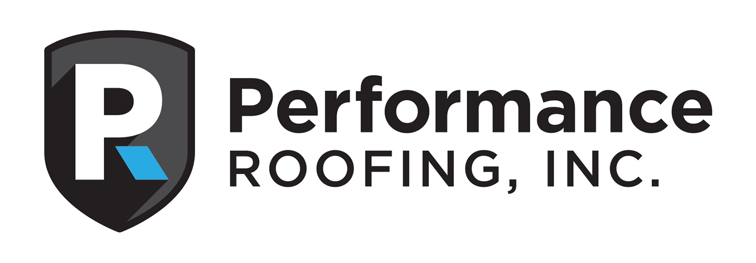
About 13 years ago, we had the opportunity to help rebrand Performance Roofing with a new logo and visual identity (shown below). This year, they’re celebrating an impressive milestone – their 50th anniversary!

PRI-roofing-logo

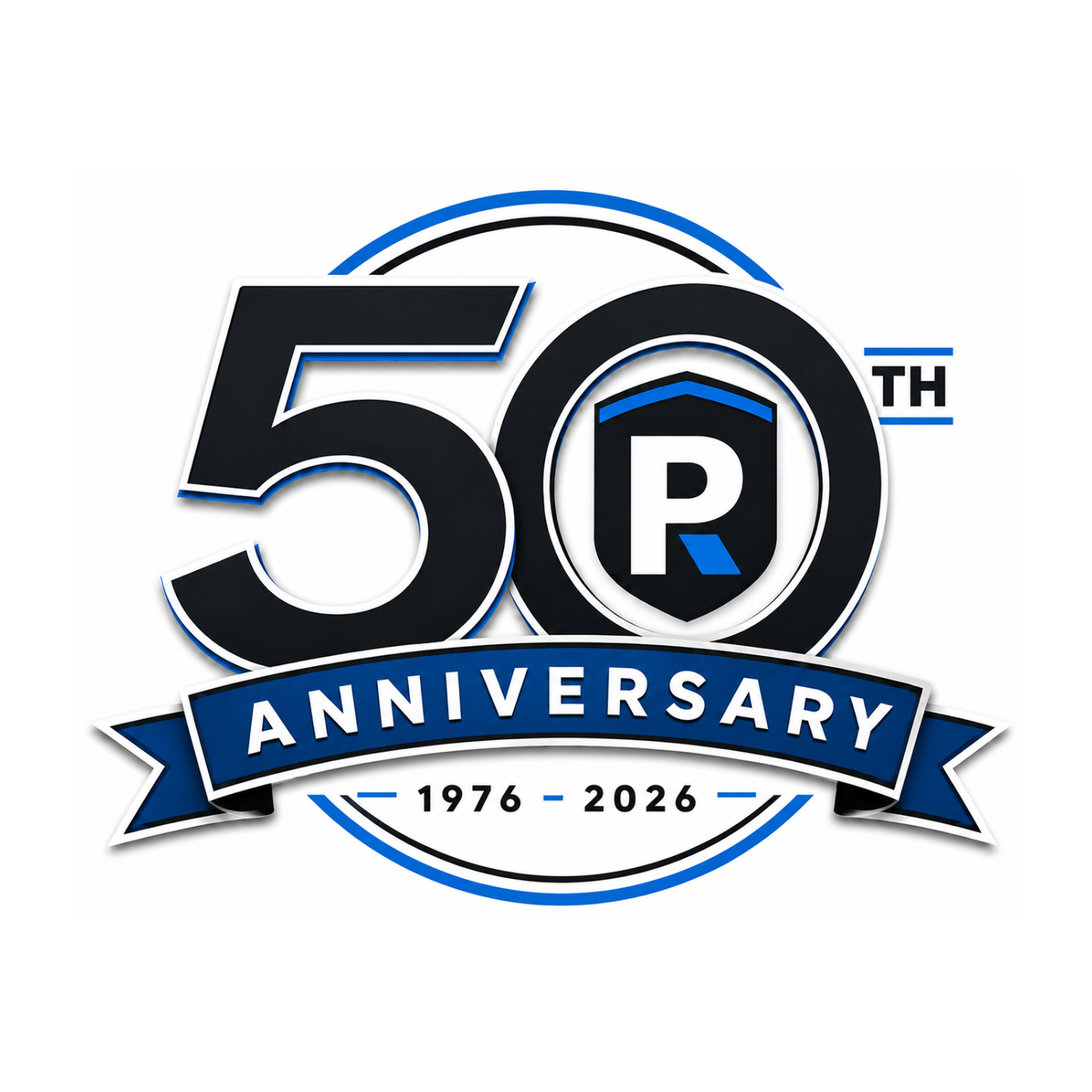
To commemorate the occasion, they needed a quick anniversary logo, and it appears they turned to AI to generate one (shown below).

Performance Roofing 50th Anniversary Logo

Unfortunately, they weren’t completely happy with the result – and we can see why. The colors didn’t match their established brand palette, their original logo had been altered, and the overall design felt somewhat generic. Most importantly, it didn’t incorporate the recognizable visual elements that have helped define the Performance Roofing brand over the years.

So, they came back to us to create a 50th anniversary logo that actually felt like Performance Roofing.

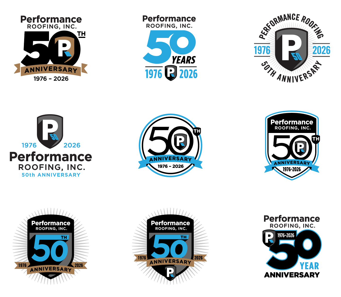
Below are our initial explorations, using the proper brand colors, logo icon, and established visual elements to create an anniversary mark that feels cohesive with the Performance Roofing brand:

Performance Roofing 50th Anniversary Logos

Exploring the 50th Anniversary Identity

Rather than creating an anniversary logo that felt disconnected from the existing brand, we explored several directions built around Performance Roofing’s established visual identity. Each concept uses the company’s signature black, gray, white, and blue color palette while incorporating recognizable elements from the original logo – most notably the shield and stylized “PR” icon.

From there, we experimented with different ways to make the 50 the focal point. In some concepts, the existing shield becomes part of the anniversary mark itself, while others integrate the “PR” icon directly into the zero. We also explored badge-style designs, circular anniversary seals, banners, and more contemporary typographic arrangements to give the company a range of options – from traditional and commemorative to clean and modern.

Throughout the process, the goal was to celebrate the milestone without losing sight of the brand Performance Roofing has spent decades building. Even without reading the company name, many of these concepts retain enough of the original logo’s colors, shapes, and visual language to still feel distinctly Performance Roofing.

And I think there is another good design point worth mentioning: the variety is intentional. You aren’t just showing nine arbitrary versions of the same badge. You’re exploring different levels of connection to the master brand – some are essentially anniversary adaptations of the existing shield, while others allow the “50” to become a larger standalone graphic for shirts, hats, vehicles, signage, social media, etc.

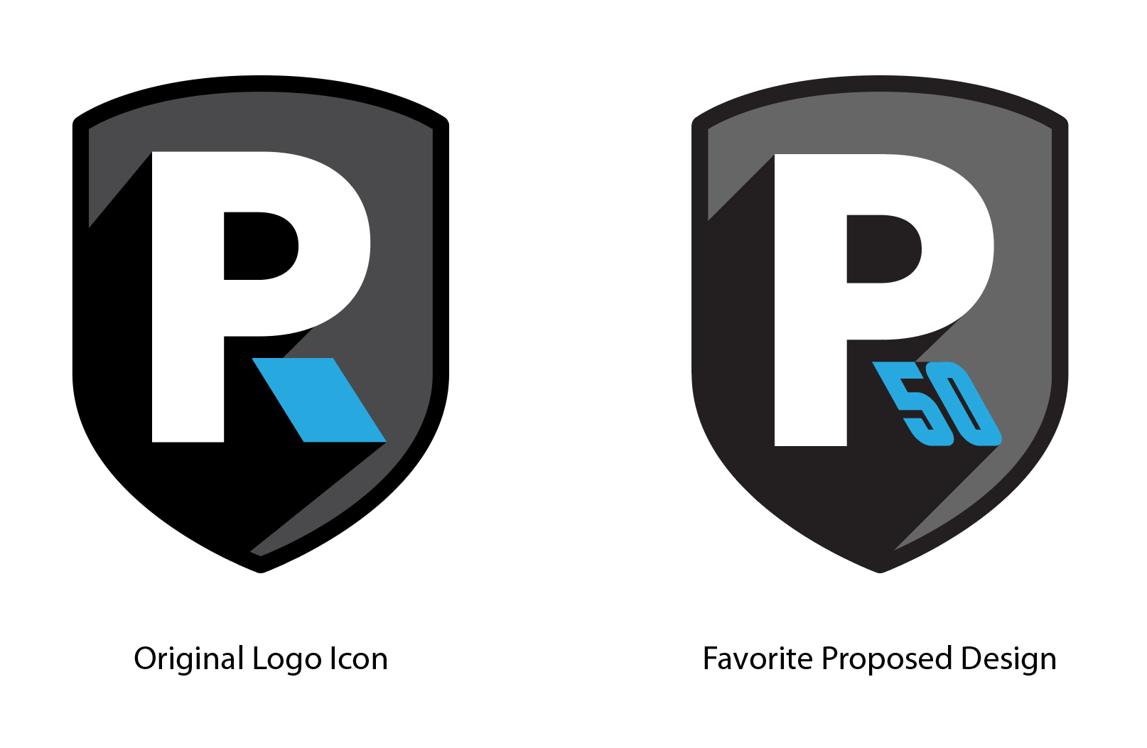
Our Favorite Option:

Of all the proposed logos, this one is our favorite. By transforming the notch in the “R” into a “50,” the design stays true to the original logo while making the anniversary feel like a natural extension of the brand. The placement also gives the “50” the appearance of shooting out from the logo, adding a subtle sense of energy and movement. Super simple, clean, and effective.

favorite proposed 50th logo design

Celebrating a Milestone? Make It Part of Your Brand.

A company anniversary is more than just a number – it’s an opportunity to celebrate your history while reinforcing the brand you’ve worked hard to build. Whether you’re celebrating 10, 25, 50, or 100 years, Visual Lure can create a custom anniversary logo that complements your existing identity and feels like a natural extension of your brand.

Have a milestone coming up? Contact Visual Lure to create an anniversary logo worth celebrating.

Custom Packaging for a Nebraska Sorghum Farmer

Posted on March 27, 2026

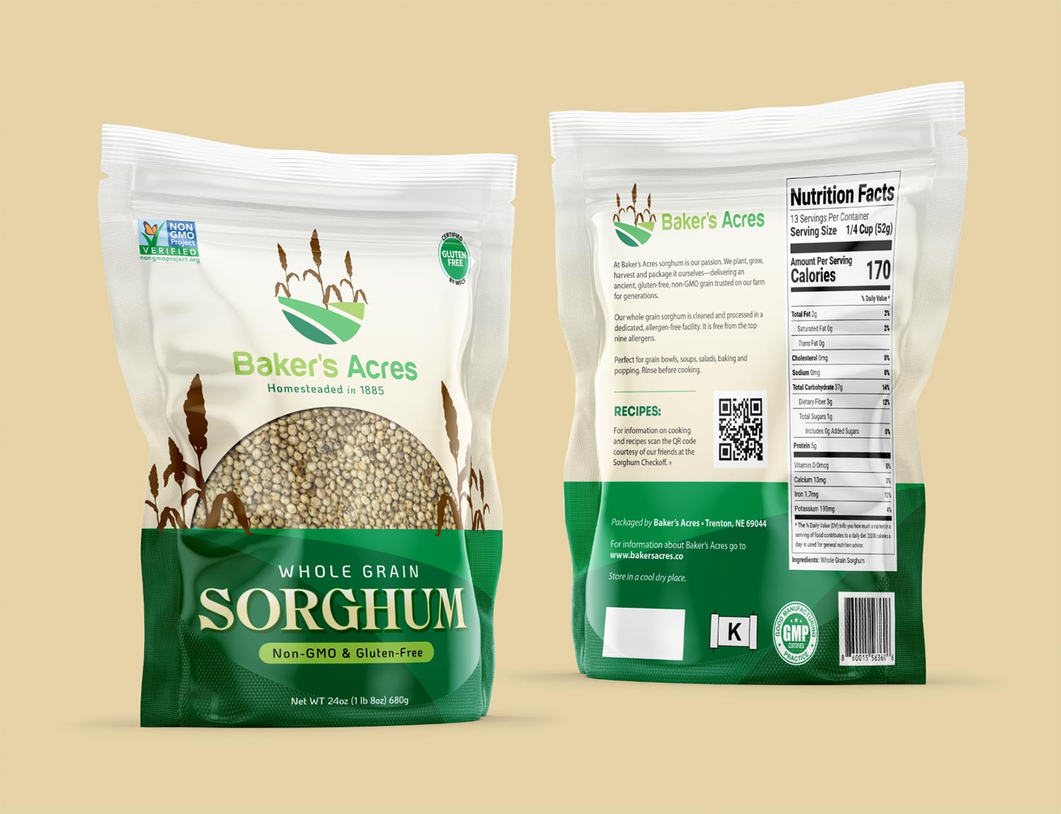
Baker’s Acres recently partnered with Visual Lure to design a custom stand-up pouch tailored to hold 1.5 lbs of their sorghum. A fifth-generation farm, Baker’s Acres continues to cultivate the same land their family originally homesteaded in 1885. Today, the Southwest Nebraska operation is proudly run by Mike Baker and his family, carrying on a long-standing agricultural legacy.

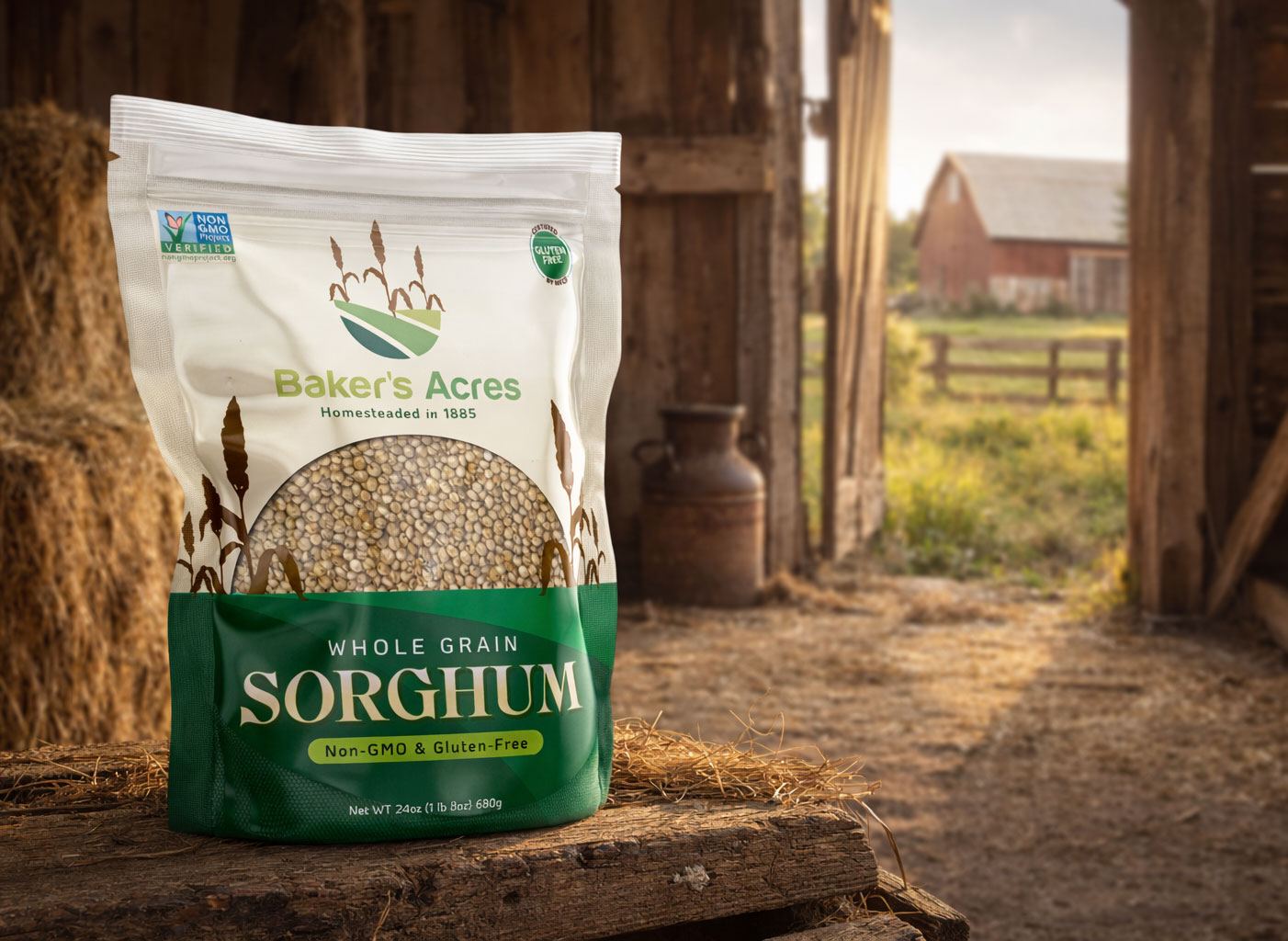
With only their logo provided, we used it as the foundation and inspiration for the entire packaging design. Elements from the logo were thoughtfully extended into the layout, including incorporating the field as a grounding base along the bottom of the pouch. At their request, we integrated a product window to showcase the sorghum, shaping it as a sunrise/sunset form and flanking it with stylized sorghum plants inspired by the logo. The branding is prominently centered at the top, creating a clean, balanced composition that highlights both the product and the heritage behind it.

The final packaging will be printed and produced by Roastar using a custom template, as none of their standard sizes properly accommodated 1.5 lbs of Baker’s sorghum. With a diverse lineup that includes stand-up pouches, gusseted bags, flat-bottom styles, flat pouches, and fill-and-ship mailers, Roastar provides packaging solutions that combine product protection with standout shelf appeal.

sorghum packaging design

Baker's package design scene

Do you need Eye-Catching Package Design?

From concept to shelf-ready design, we help bring products to life through thoughtful packaging. Serving clients from St. Louis to Nebraska—call or email us, we’d love to help you with your project.

Branding an O’Fallon, llinois Real Estate Company

Posted on March 23, 2026

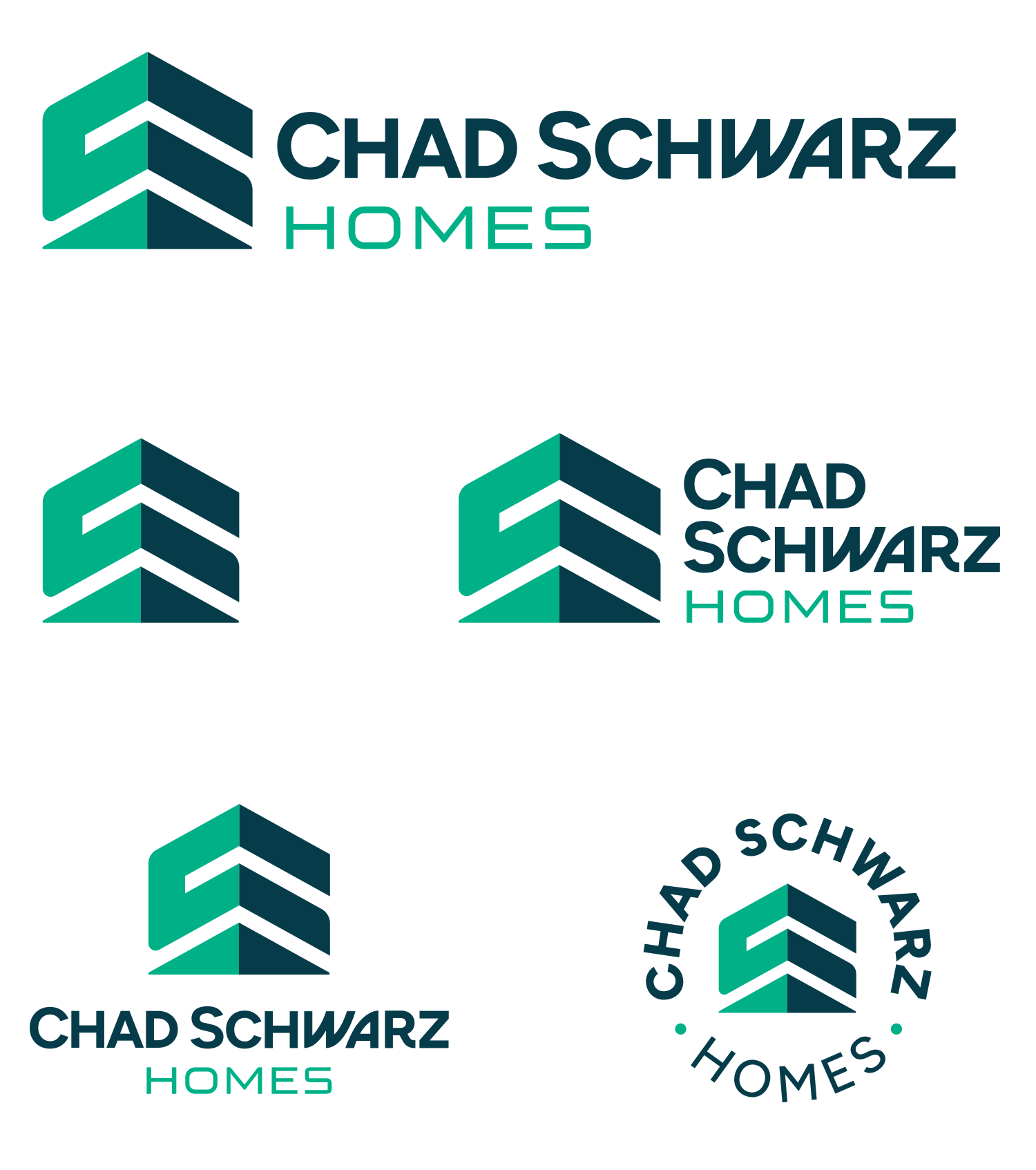
Our friend Chad recently set out on his own to launch a new real estate company and came to us for help developing his brand and logo. He initially explored a few AI-generated concepts, but they ultimately fell short of capturing the level of quality and intention he was looking for—so he turned to us to bring it all together.

We took those early ideas as a starting point, refining and elevating them into more thoughtful, well-crafted design directions. After exploring several options, this is the direction he ultimately chose (which wasn’t based on one of the initial AI concepts):

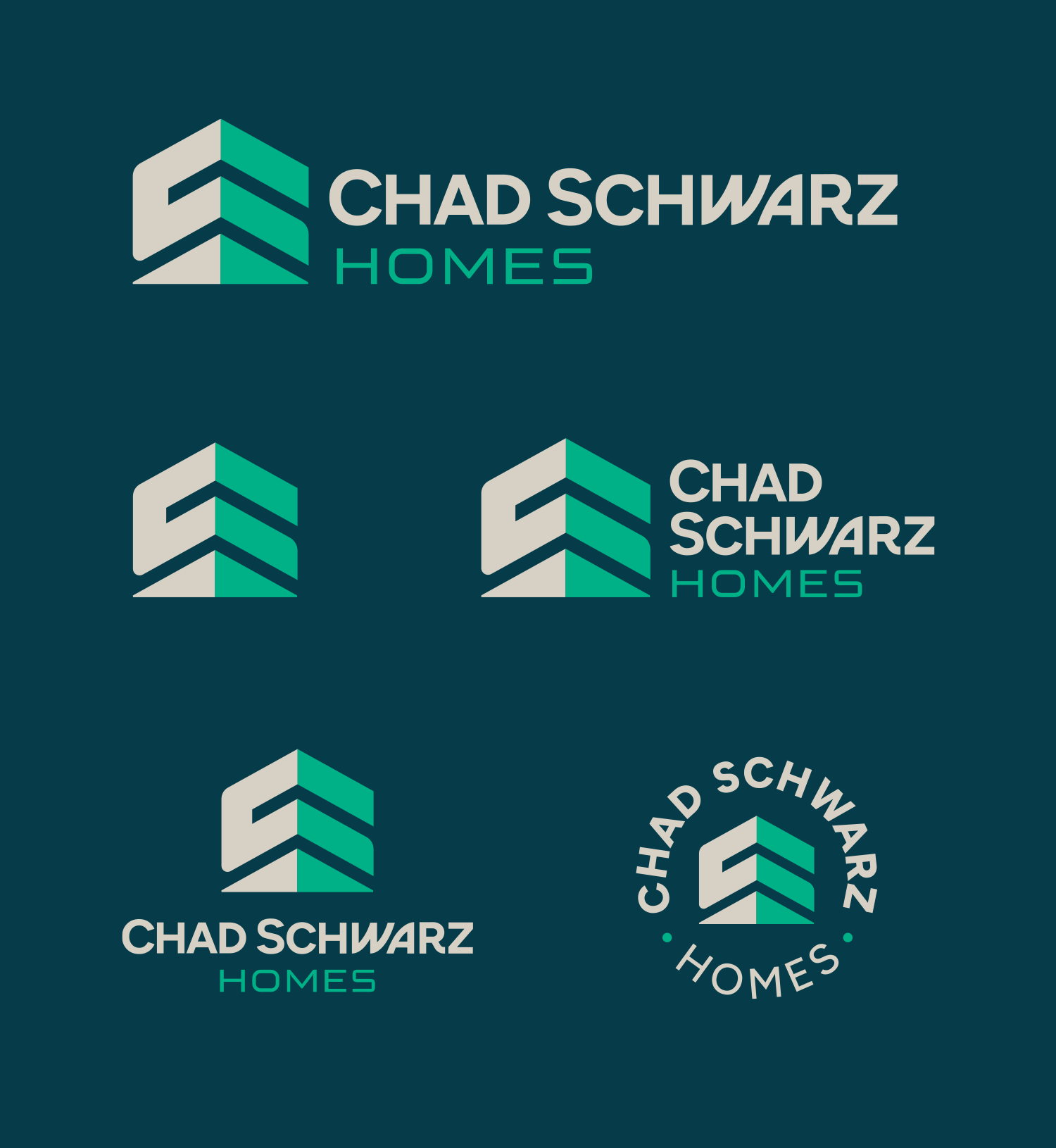
Final logo lockups:

CSH logo lockups on a white background


Final logo lockups on dark background:

CSH logo lockups on a dark background


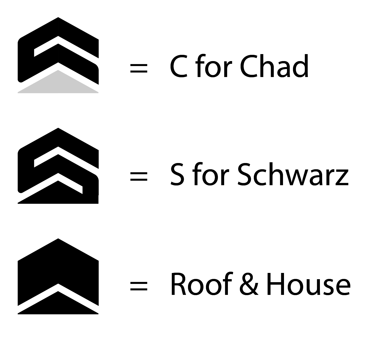
…the Logo Explained:

CSH logo explained

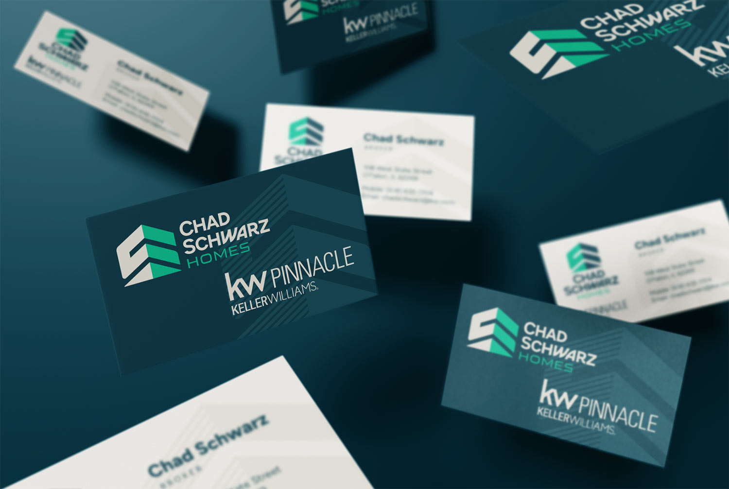
Business Card Design:

CSH business card design

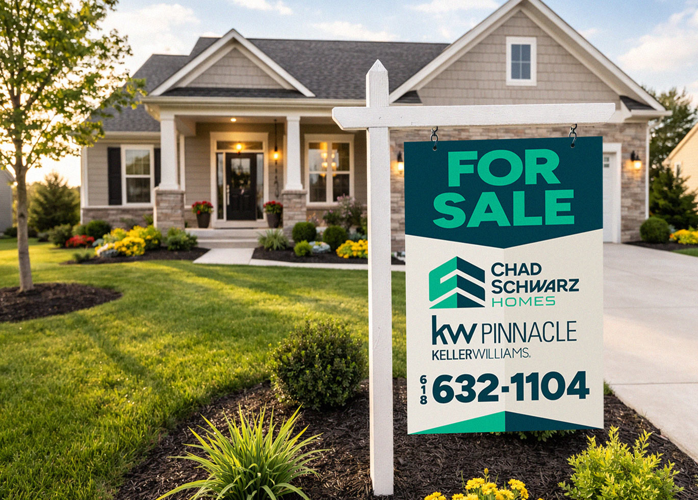
Their Branded For Sale Sign Design:

CSH sign design

…and the potential for swag:

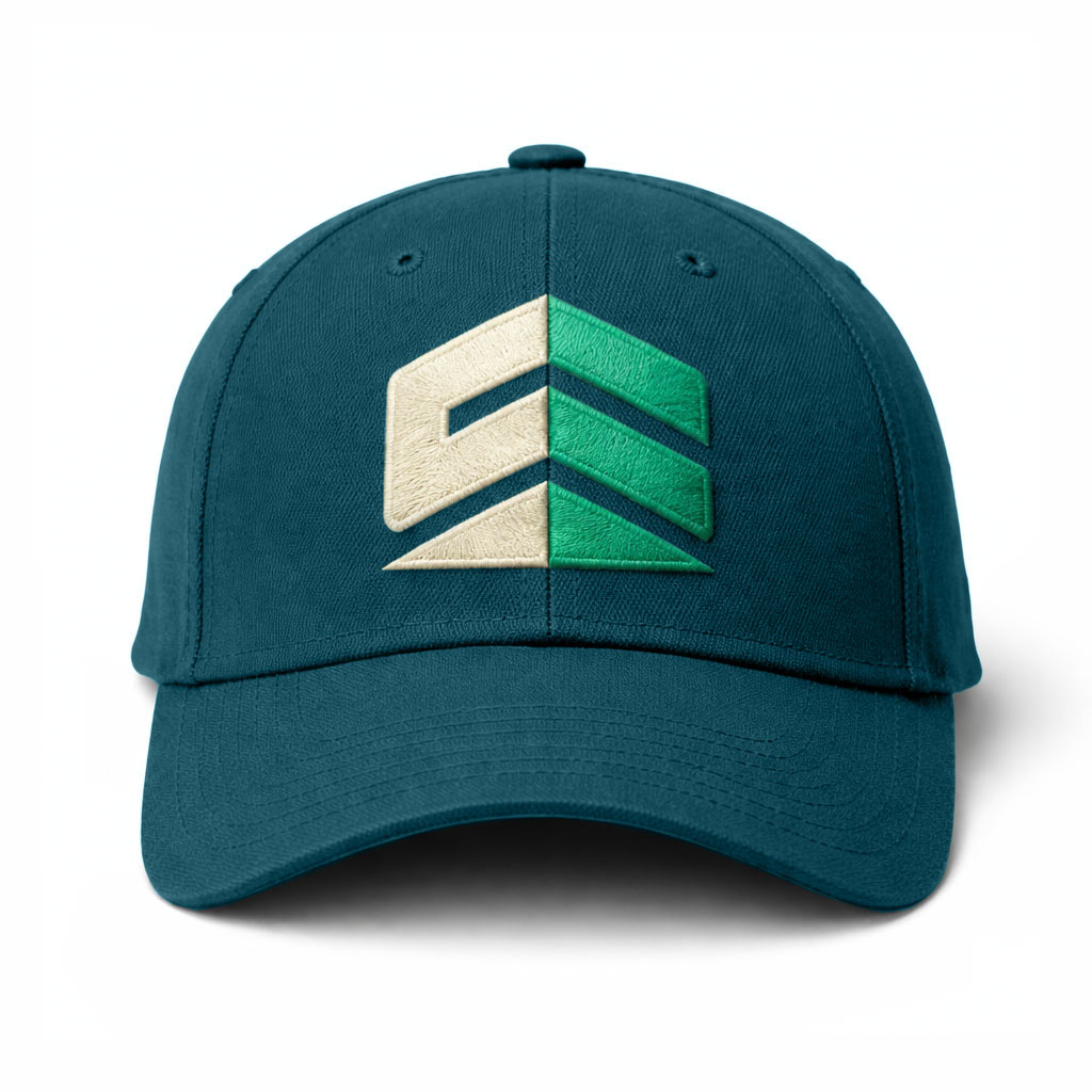
CSH hat design

Do You Need Help?

Ready to elevate your brand? Whether you’re starting from scratch or refining an existing identity, we create logos and branding that are built to last. Let’s talk about your project.

Logo Clean-up/Upgrade for O’Fallon, IL Frozen Custard Shop

Posted on March 14, 2026

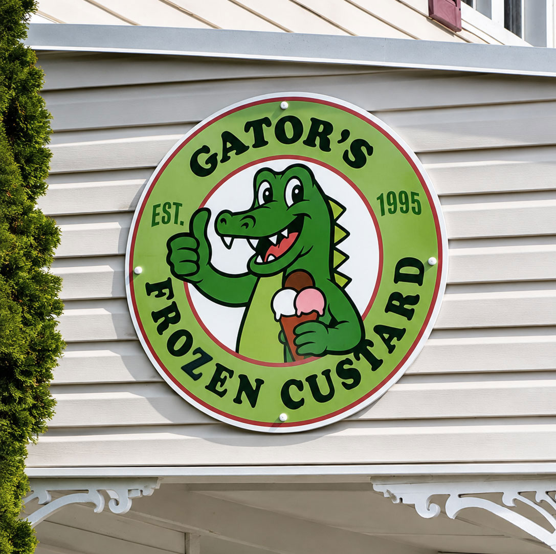
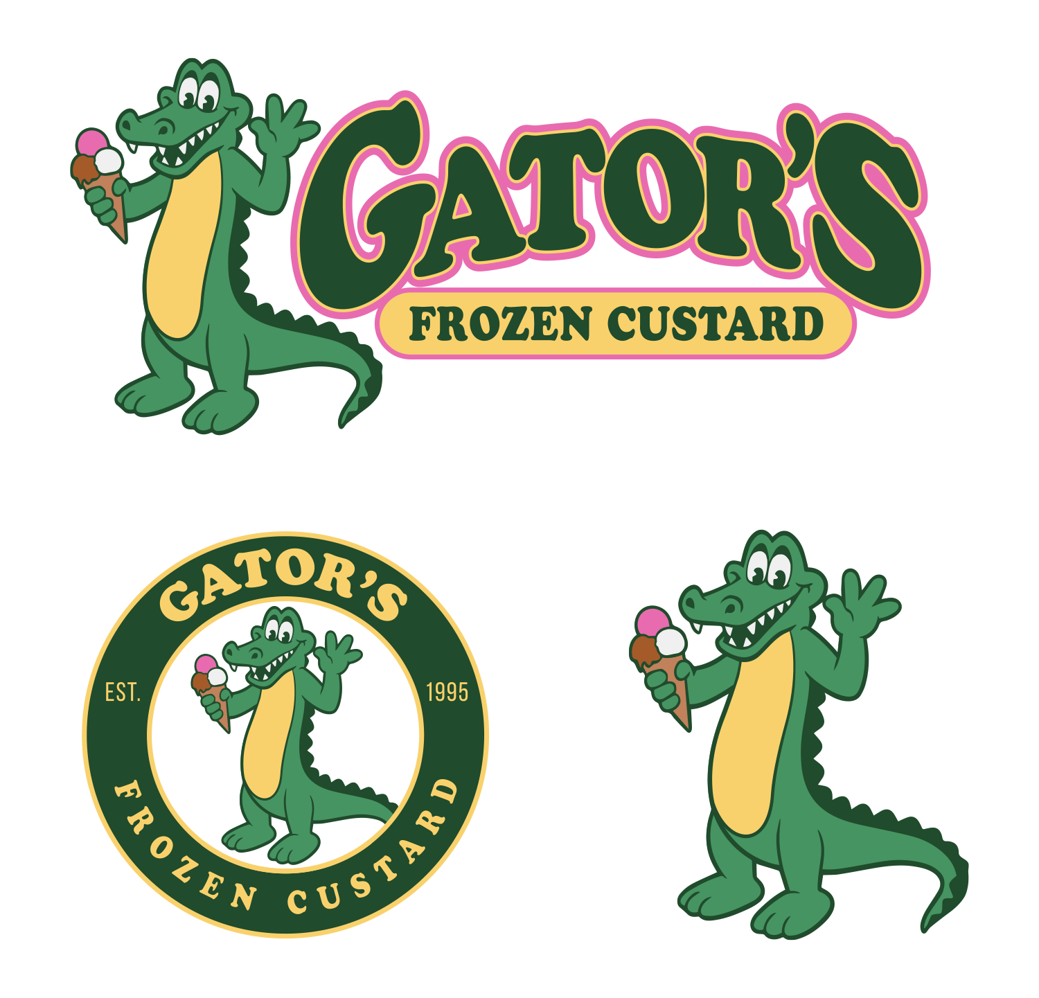
Gator’s Frozen Custard is moving to a new location and wanted to clean up their existing logo. Unfortunately, they didn’t have a vector version of the artwork. Based on the style and construction of the original, my guess is that it may have been painted by a high school or college student, or possibly an amateur artist.

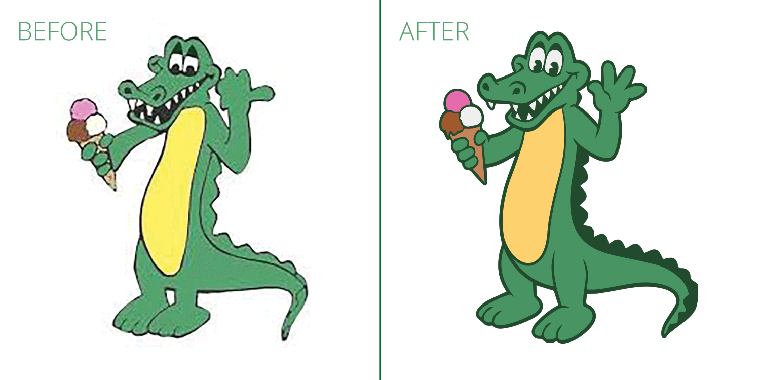
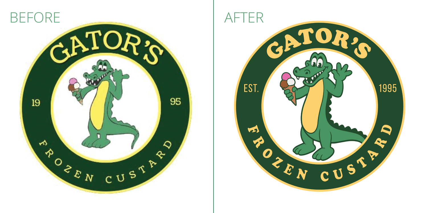
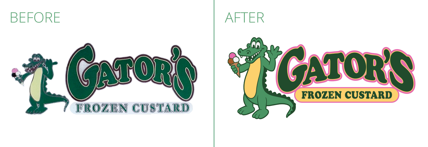
That said, the logo definitely had a certain charm, so our first instinct wasn’t to completely reinvent it. Instead, we focused on preserving the personality of the original while correcting some of the problem areas—adjusting awkward proportions and angles, refining the line work, and converting the artwork into a clean vector format. This ensures the logo can now be scaled to any size, whether for signage, packaging, or other large-format applications.

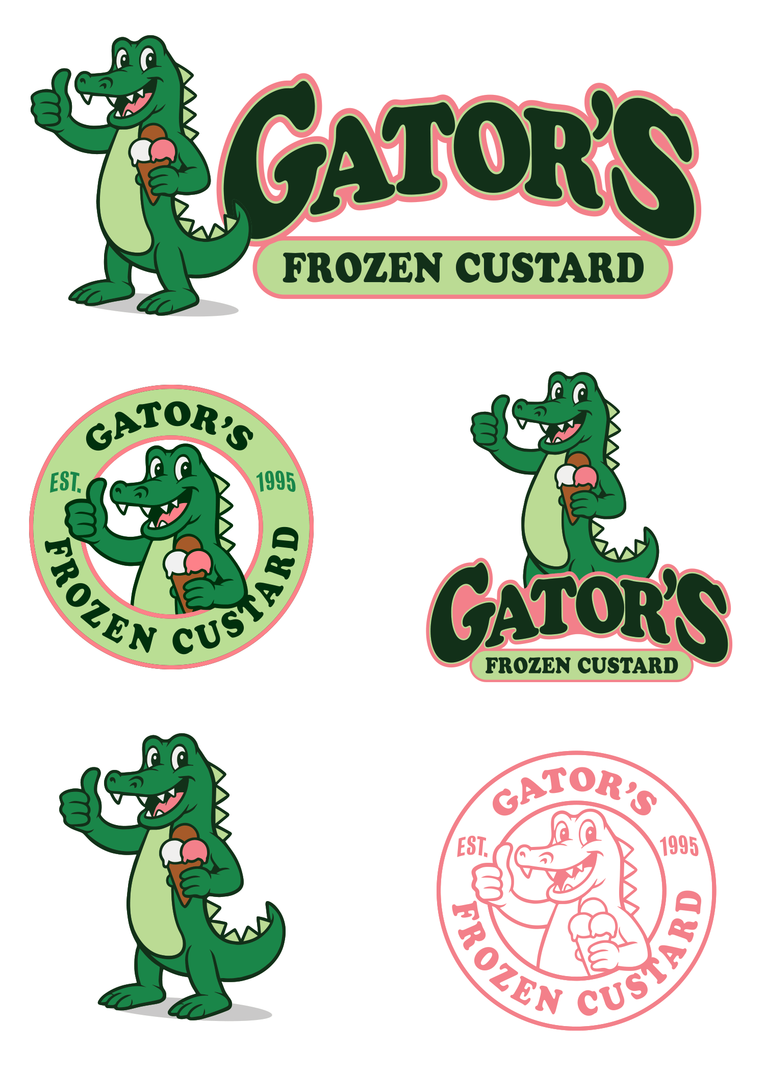
In addition to refining the existing character, we also explored an alternative direction of our own—one that completely reimagined the mascot without being constrained by the style of the original alligator illustration. This is the direction they ultimately selected.


Original Gator (before & after)


Original Logo Seal (before & after)


Original Horizontal Logo (before & after)


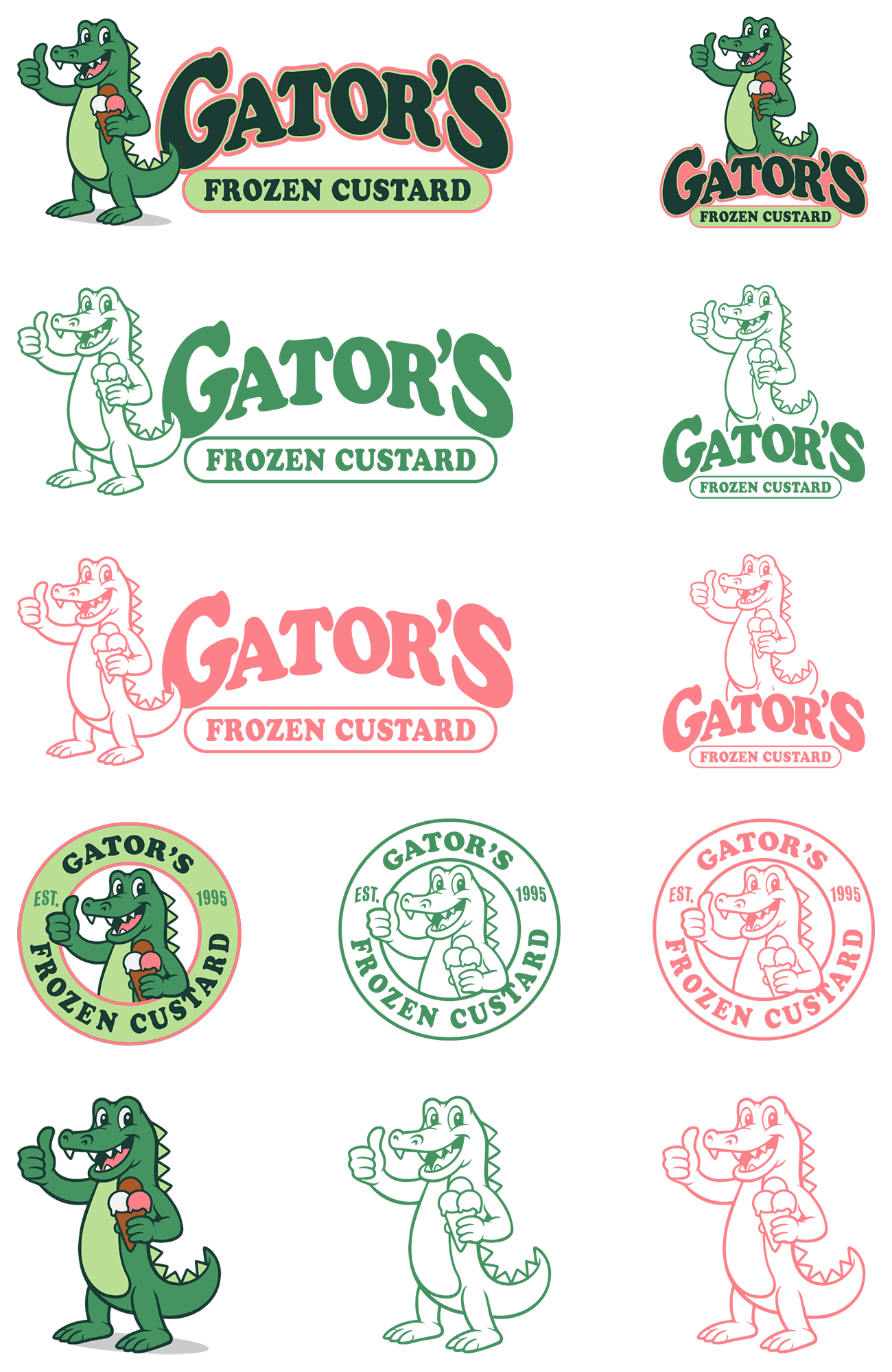
Updated Logo Lockups:

…and here is our proposed new logo – which they decided to go with!

Gator's updated logo design 2


All the Final Logo Lockups:

Gators all logo lockups


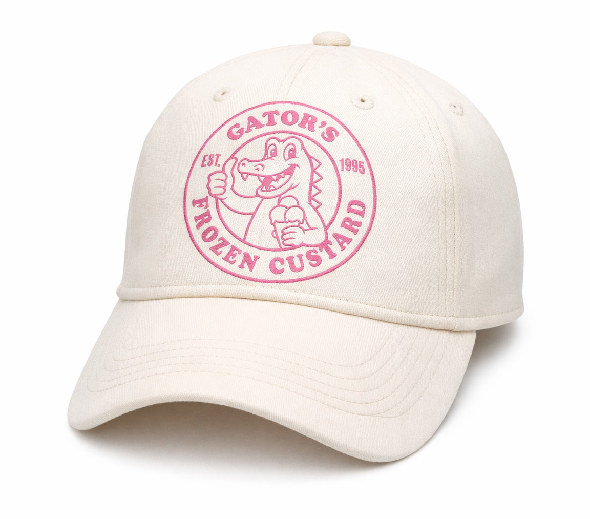
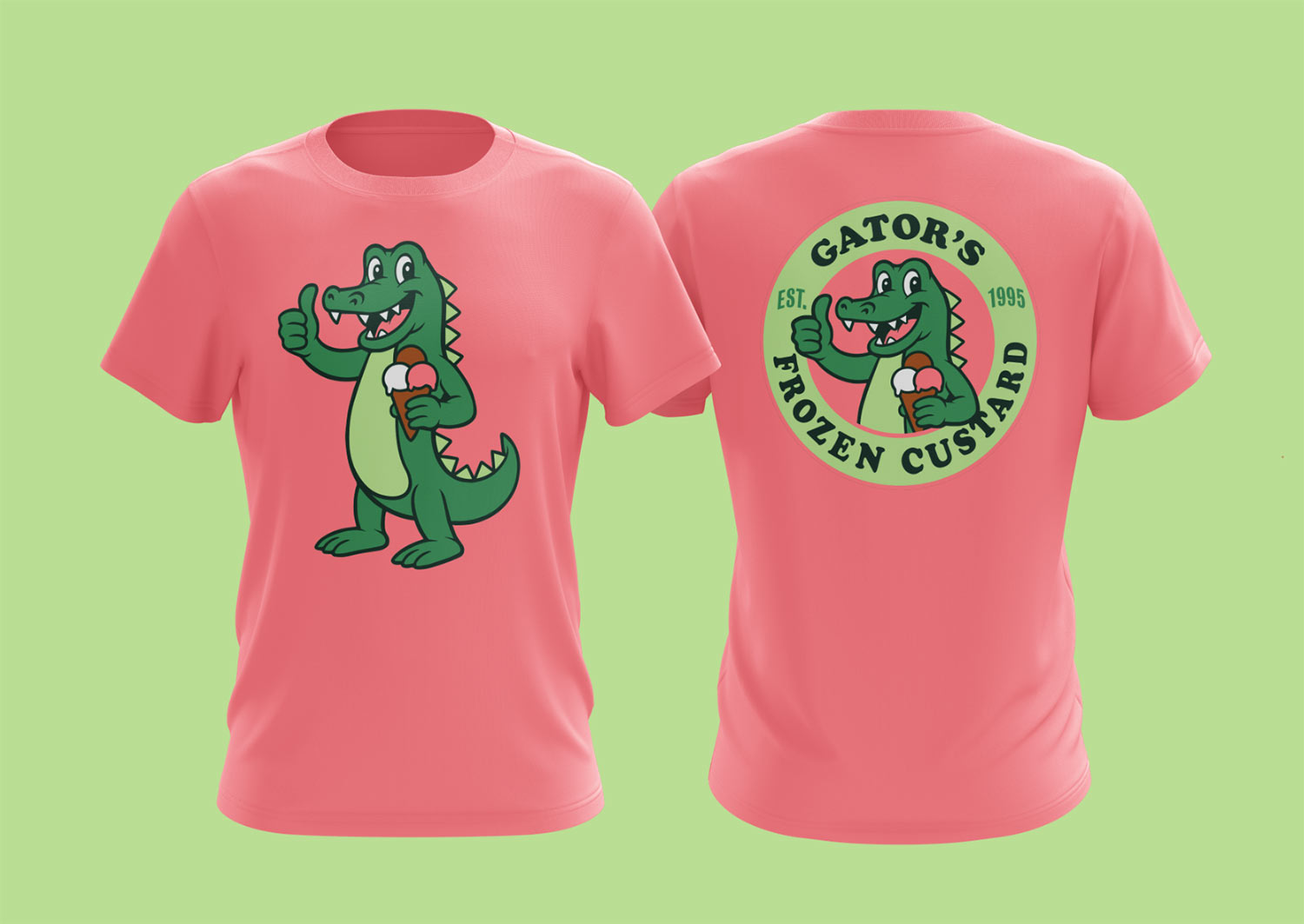
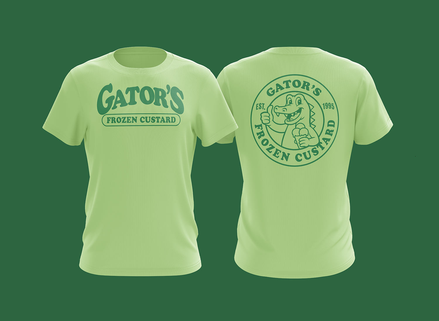
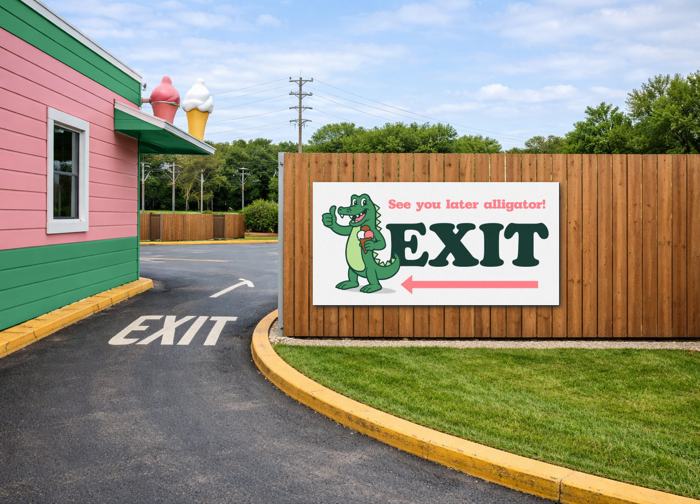
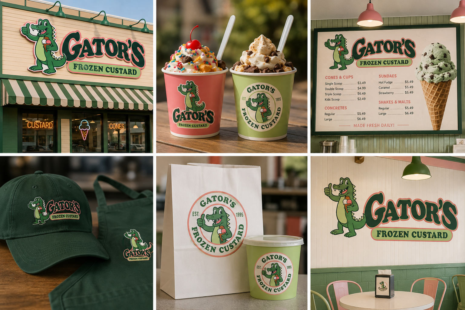
…and showing the possibilities with some mockups:

gators hat design gators t-shirt design

Gator's t-shirt design 2

Gators-exit-sign-design

Gators design branding mockups

Ready to Refresh Your Logo?

If your logo feels outdated, isn’t scalable, or simply no longer reflects the quality of your business, it might be time for an upgrade. Whether you need a subtle refinement that preserves your brand’s equity or a complete redesign, Visual Lure can help transform your existing logo into a polished, professional brand asset. From vector cleanups and modern refinements to full rebrands, we specialize in creating logos that are built to perform across signage, print, merchandise, and digital platforms.

Let’s give your brand the professional eye-catcher it deserves. Contact Visual Lure today to discuss your logo update or full rebrand.

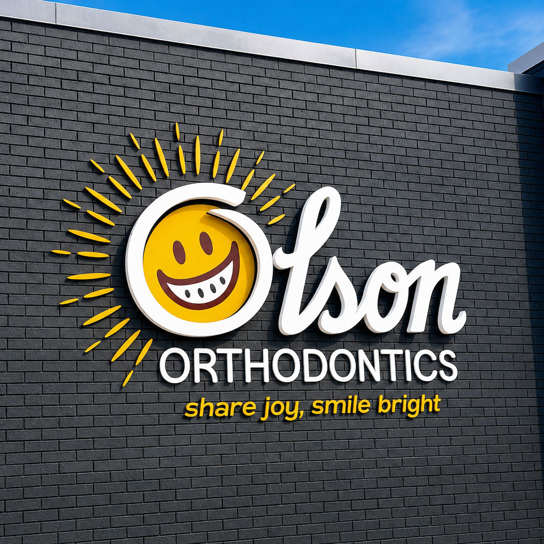
Rebranding a Local O’Fallon, IL Orthodontics Practice

Posted on March 6, 2026

Visual Lure recently worked with a local orthodontic practice to refresh their logo and implement a subtle rebrand in preparation for their upcoming move to a new location. Because the practice is already well established and widely recognized in the area, it had built strong brand equity over the years. With that in mind, our initial approach was to preserve the familiarity of the existing brand while giving it a more refined and contemporary feel. Rather than reinventing the identity, we proposed a thoughtful logo update that would modernize the look while maintaining the elements patients already associate with the practice.


Here was our initial proposal:

OUR ASSESSMENT of THEIR EXISTING LOGO:

Updated/refined proposed logo:

Sample of usage:


After reviewing the initial concept, they asked if we could incorporate a sun element to reflect their new tagline, “Share Joy, Smile Bright”. They had also selected a new color palette inspired by the colors chosen for their upcoming location, which they wanted the refreshed identity to reflect. In addition, they felt the typeface we selected for ORTHODONTICS wasn’t quite the right fit, so we explored alternative font options that better aligned with the updated direction.


New color palette and final approved logo:

New logo and color palette

…and the final logo lockups:

Final OO logo lockups

…we also knocked out some additional brand elements / spot illustrations using the same style as the logo:

brand elements/spot illustrations

…and last but not least, a couple mockups:

olson business card design

Olson hat design


BEHIND THE SCENES WORK

We also presented an additional concept to ensure the updated logo was truly what they wanted. This option explored a cleaner, more modern approach, giving them the opportunity to consider a bolder evolution of the brand before committing to the initial direction.

This proposed logo explained:


Is you brand ready to evolve?

Every brand reaches a point where it needs to evolve. Sometimes that means a subtle logo refinement to modernize the look while preserving hard-earned brand recognition. Other times, it calls for a more significant rebrand that reflects growth, new services, or a new direction. The key is finding the right balance between honoring the past and positioning the brand for the future.

In this case, the goal was to maintain the strong brand equity the practice had built in the community while introducing thoughtful updates that aligned with their new location, new color palette, and uplifting new message: “Share Joy, Smile Bright.” By exploring multiple directions—from a refined update to a more modern interpretation—we were able to help guide the process and ensure the final result felt both fresh and familiar.

If your business is starting to feel visually outdated, preparing for growth, or simply looking to strengthen how your brand is perceived, a logo refresh or full rebrand can make a powerful impact.

At Visual Lure, we specialize in creating professional eye-catching designs that help businesses stand out and make lasting impressions. Whether you need a completely new logo, a strategic brand refresh, or a thoughtful evolution of your existing identity, we’d love to help bring your vision to life.

Ready to elevate your brand? Contact Visual Lure today to start the conversation.