Five Award-Winning Visual Lure Logo’s Selected for LogoLounge Book 15
Even after being previously selected for 11 LogoLounge books, receiving this email NEVER gets old. This will mark the 12th book and the 69th logo featured in the LogoLounge series—with five award-winning logos selected for Book 15.
![]()
Pop the confetti — your work has been chosen for LogoLounge Book 15! Out of 30,000+ submissions from around the world, your work was selected by our panel of industry-leading judges for inclusion in the next volume of LogoLounge. That’s an incredible achievement, and we’re beyond excited to welcome you as a winner!
Your work stood out in a sea of top-tier design, and now it’s joining the ranks of the best in the business. We hope you’re as proud of this moment as we are to showcase your work.
To help you celebrate, we’ve created a brand new winner badge just for Book 15 winners. Post it on your website, share it on social, or just take a moment to bask in your greatness. You’ve earned it!
Winners Certificates will also be sent out in the following week. Expect more communication surrounding that!
Congratulations again! We can’t wait to see what you design next.
Best,
The LogoLounge Team
I present to you, our five award-winning logos (two of which are Visual Lure logos):
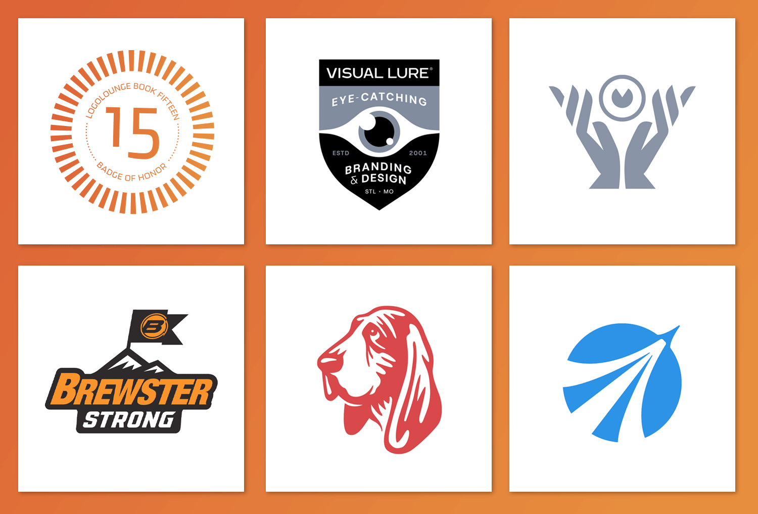
…and a breakdown of each logo:
![]()
This is a logo option for Visual Lure. It features two hands holding an eye, representing our company tagline: “Professional Eye-Catchers™.” The hands also form the letter V for VisualLure.
![]()
This is another Visual Lure logo. It is a badge logo and features a smooth curved modern eye in the middle of a crest.
![]()
This was an unselected logo option for a company called Mach 3 Business Solutions, a business consulting agency based in Houston, Texas. The logo features an aircraft launching into the atmosphere, with its trail forming three lines and the letter M for Mach 3.
![]()
This was an unselected logo option for an internal program at a large excavating company, Brewster Companies, Inc. It features a flag with the Brewster logo on it, placed at the summit of a mountain.
![]()
Here’s the story behind this logo. Visual Lure was originally contracted to design billboards for Ole Red, an H₂S scavenging company. We weren’t hired to work on the logo, but during a flight with nothing to do, I started resketching it because the original design really bothered me. It had too much detail in certain areas, the lines felt choppy and unrefined, and when reduced to a small size it looked messy. I refined the lines to make them smooth and removed much of the unnecessary detail to simplify the mark. Ironically, they decided not to use it and stayed with the original. Here is a side by side:
![]()
Want to see more of our logo design work?
Click here to view our logo design portfolio, or click here to view some of our branding projects.
