Eidelman Virant Capital Logo Design
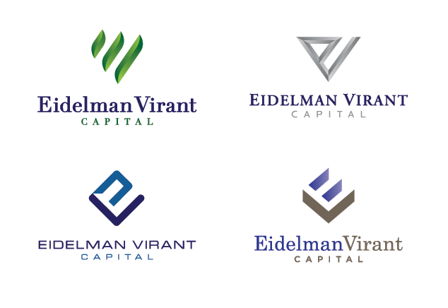
Here are our proposed logo design options for a St. Louis, MO investment firm. They wanted to use the letters E and V in the icon of their logo, and here is what we came up with. We believe the top left logo is the strongest mark. It represents a leaf in the stages of growing which symbolized the growth of wealth. It also creates the letters E and V as requested by the client.

Eidelman Virant logo design options
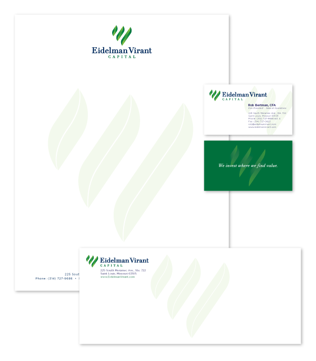
Update: Here is the final logo design with our proposed identity design:

proposed Eidelman Virant identity design

