Rebranding My Favorite Places – Part II: Dairy Haven
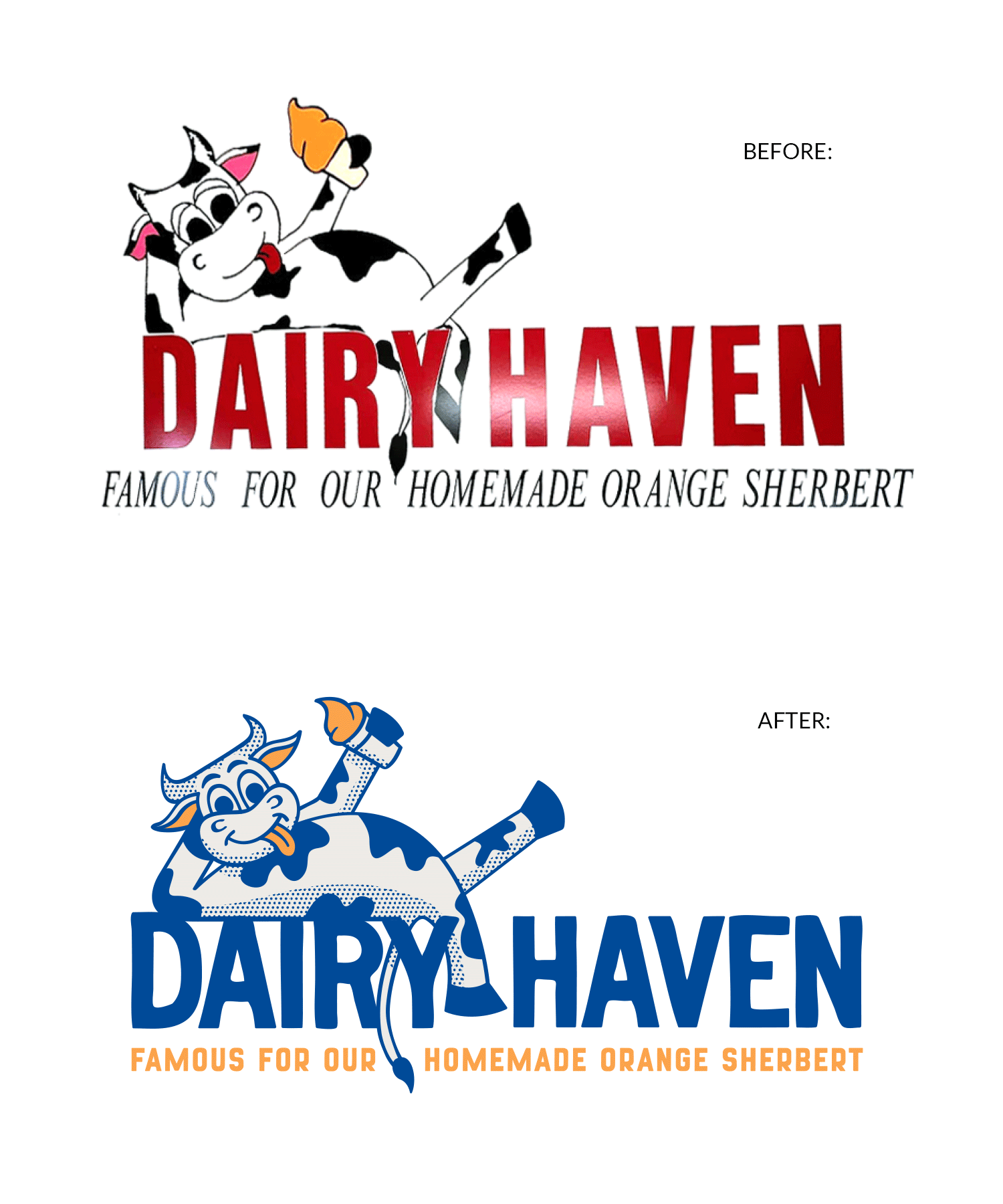
Dairy Haven in Caseyville, Illinois, is my family’s favorite spot for ice cream, with their orange twist cone being my personal favorite. I love everything about Dairy Haven, except for their logo. The current logo appears amateurish, as if a high school art student painted it with incorrect body proportions, uneven lines, and a generally rough appearance (though it does carry some nostalgia).
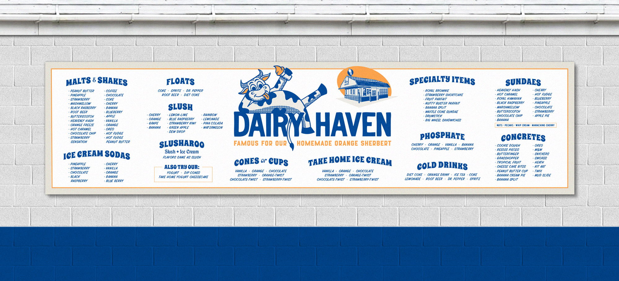
To improve this, I decided to redraw the logo from scratch. While I aimed to enhance its quality, I wanted to retain the hand-drawn aesthetic to preserve the “mom & pop” charm of the place. I chose a typeface that complements this look, hand-drawn and vintage, reflecting the establishment’s history since the 1950s. Additionally, I created a graphic of the building, which is quite charming and embodies the “All-American” ice cream shop feel that is integral to the experience. Lastly, I redesigned their signage, believing it needed a modern touch.
If you haven’t been there, I highly recommend a visit. Their address is 112 N Main St, Caseyville, IL 62232. You can find more information on their facebook page: https://www.facebook.com/DairyHaven/
Before & After
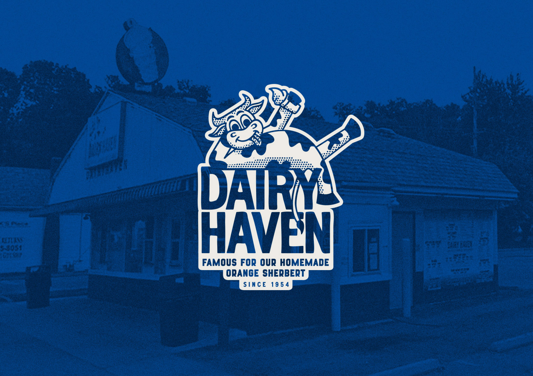
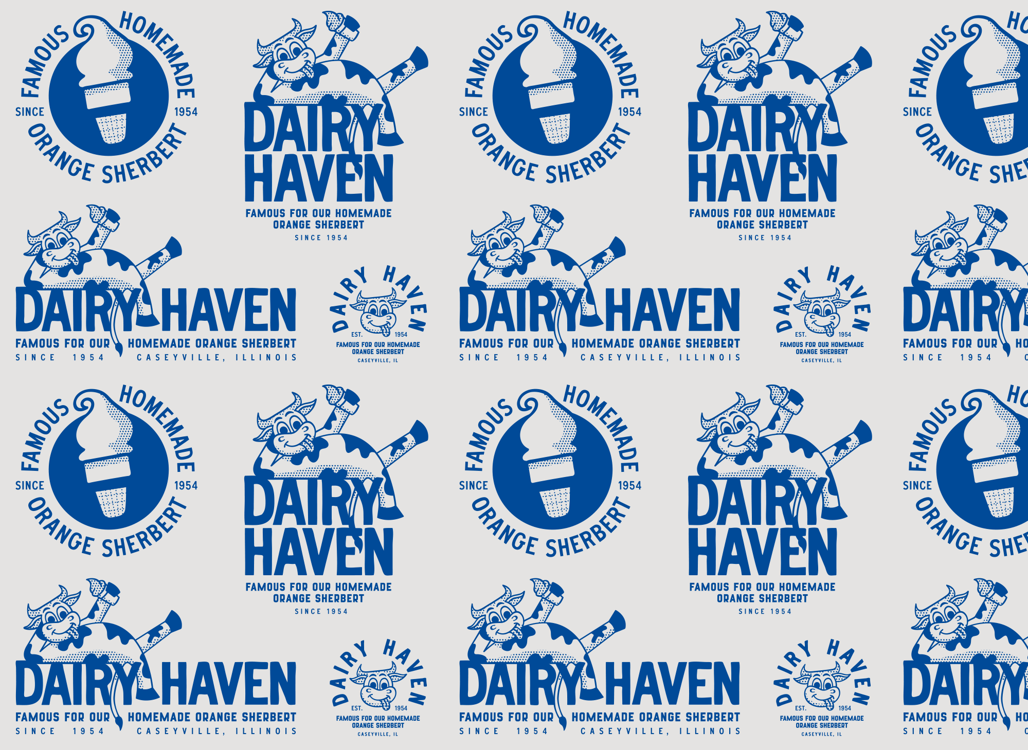
Logo Lockups & Additional Brand Elements: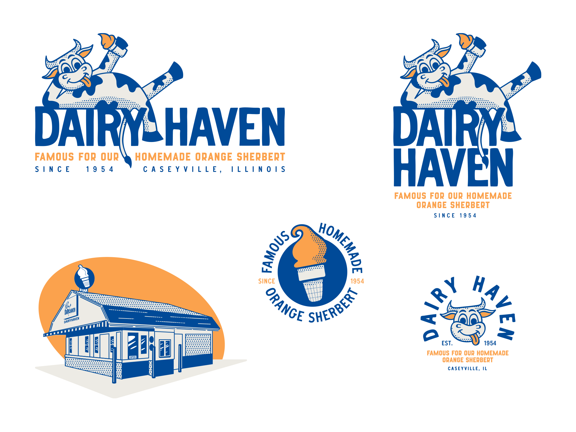
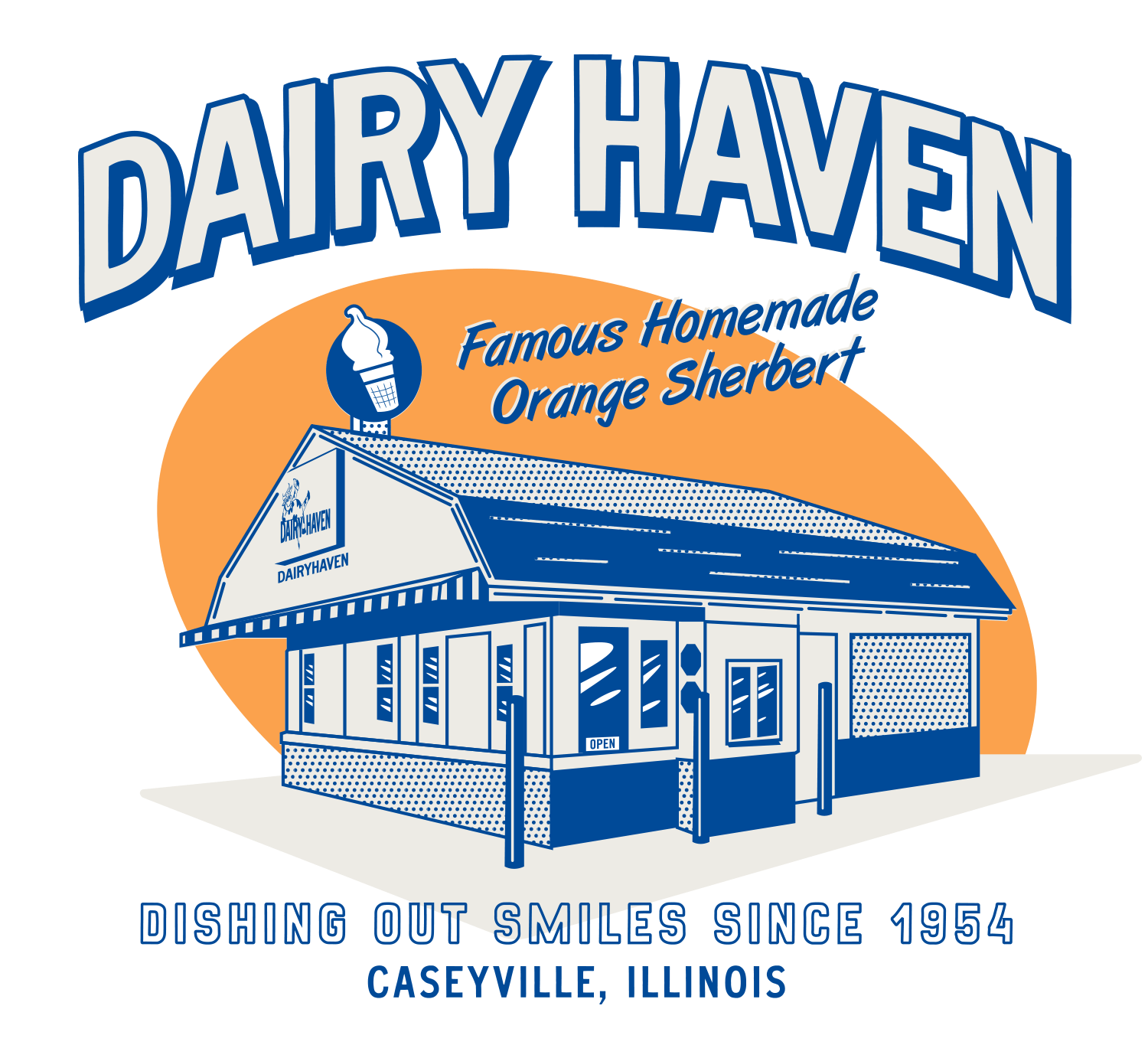
Sample Background Graphic:
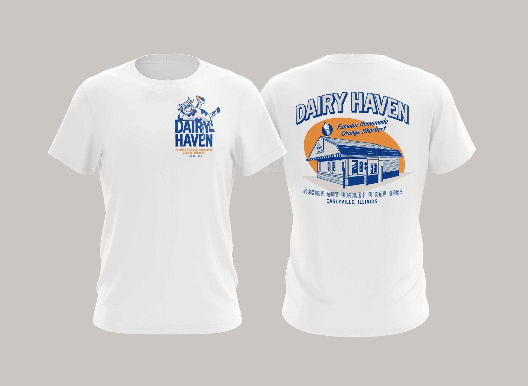
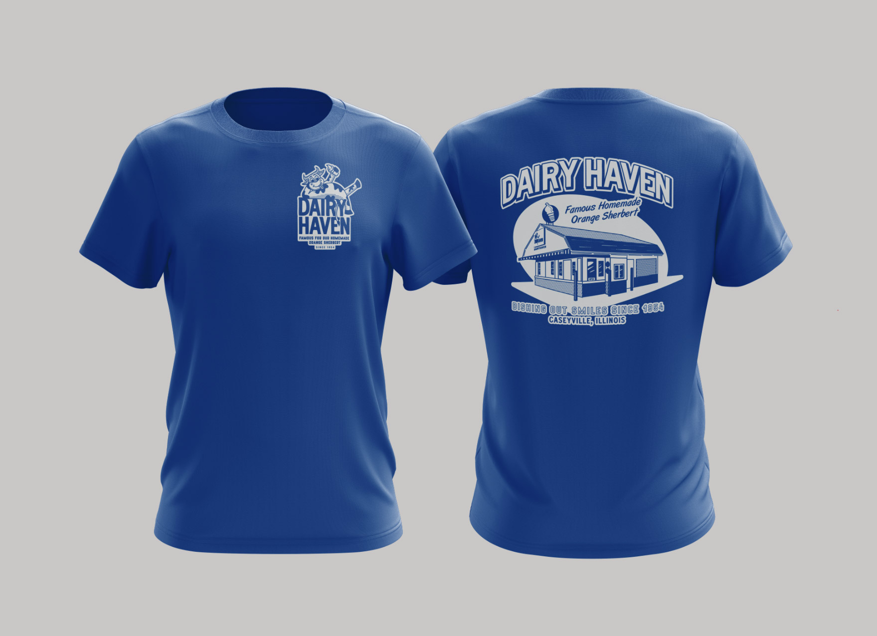
T-Shirt Designs:
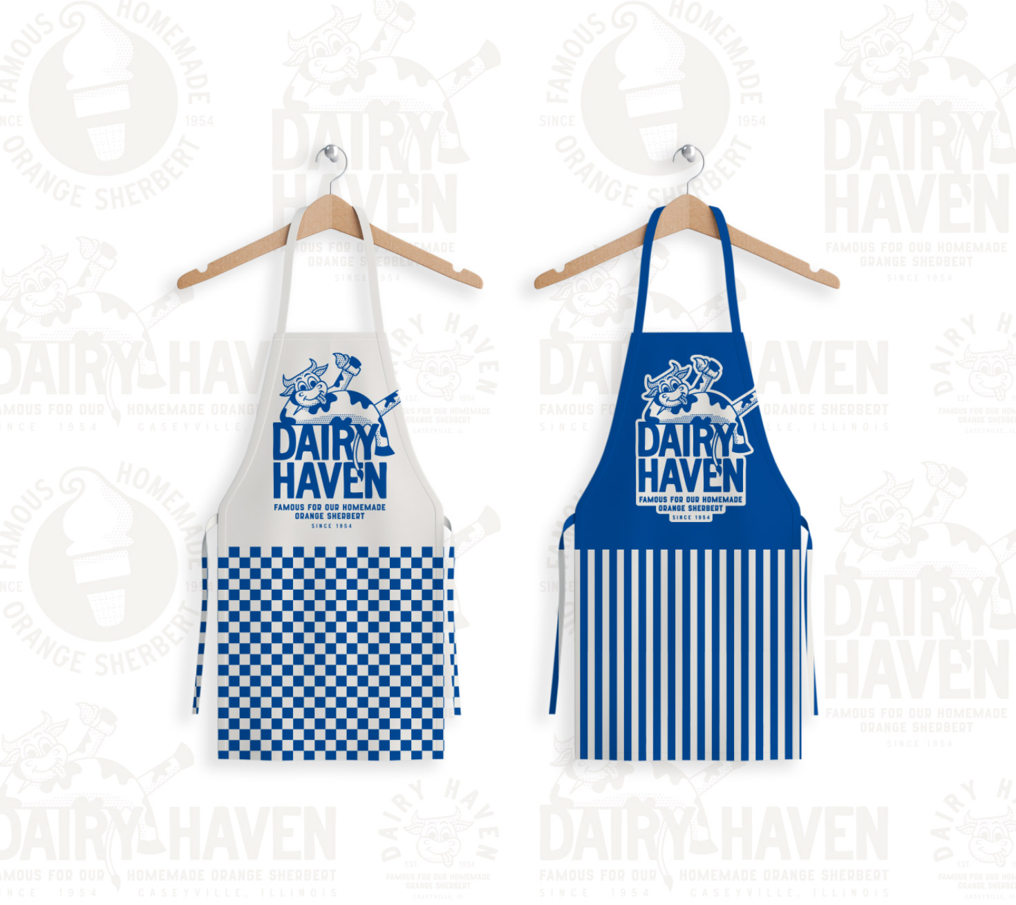
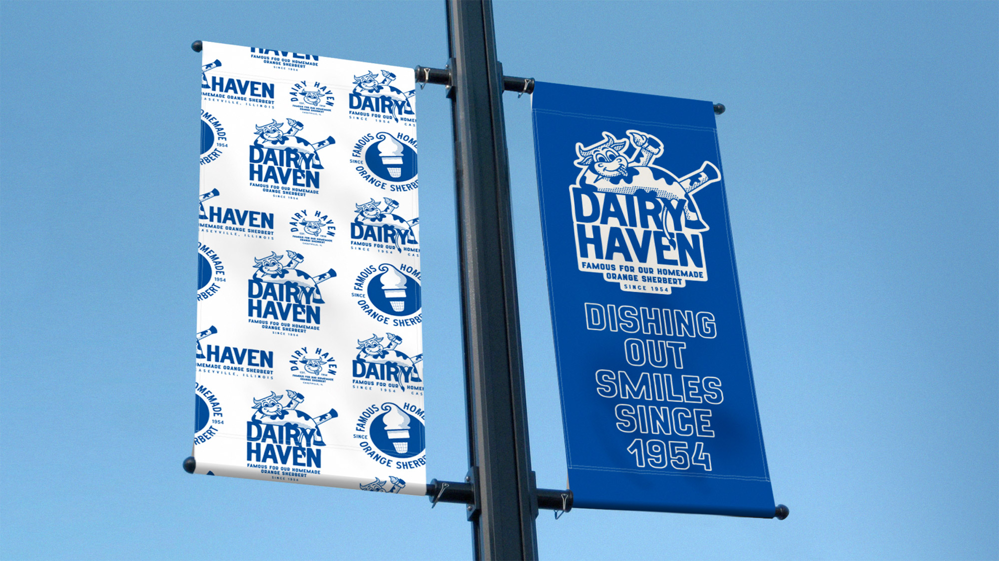
Banners:
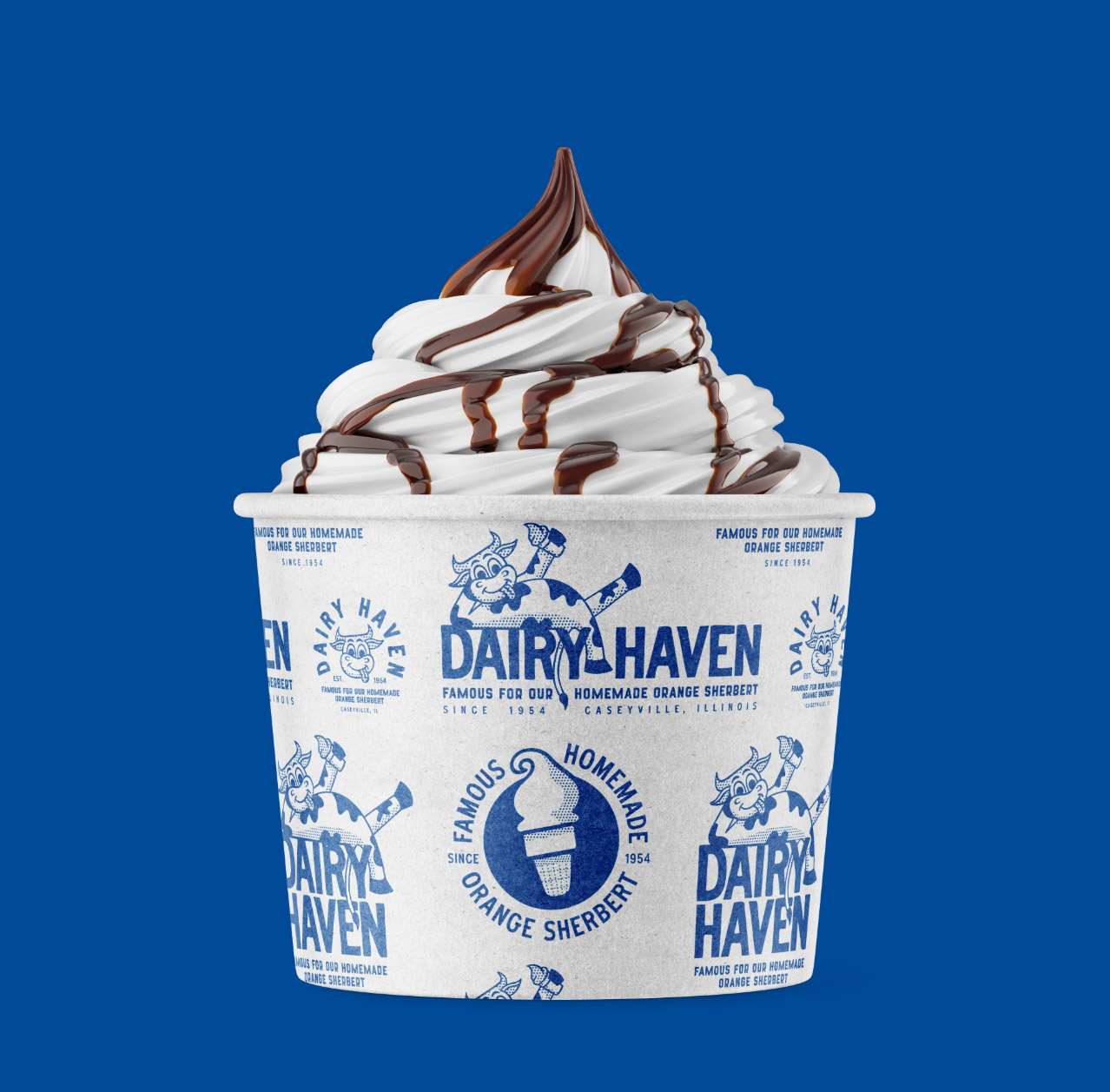
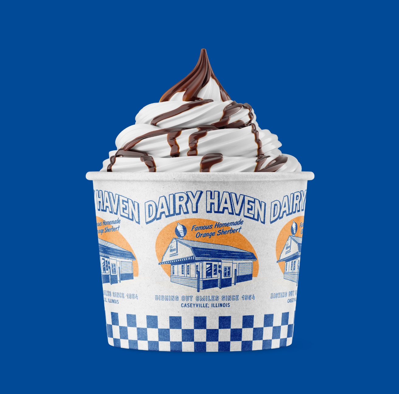
Cup Design Options:
New Sample Sign:
Needs a logo spruced up?
Does your logo have current brand equity, but it doesn’t look great and lacks visual appeal? Does your logo simply need to be cleaned up, refined, or slightly modernized? If so, we can help. Shoot us an email or give us a call today – as we would love to help.

