50th Anniversary Logo for Performance Roofing
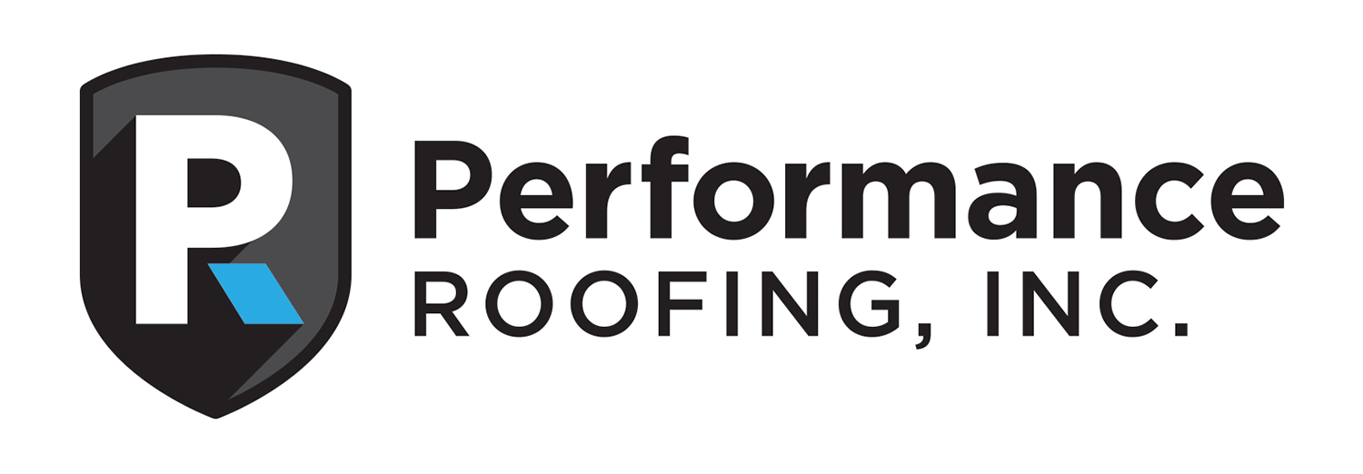
About 13 years ago, we had the opportunity to help rebrand Performance Roofing with a new logo and visual identity (shown below). This year, they’re celebrating an impressive milestone – their 50th anniversary!
To commemorate the occasion, they needed a quick anniversary logo, and it appears they turned to AI to generate one (shown below).
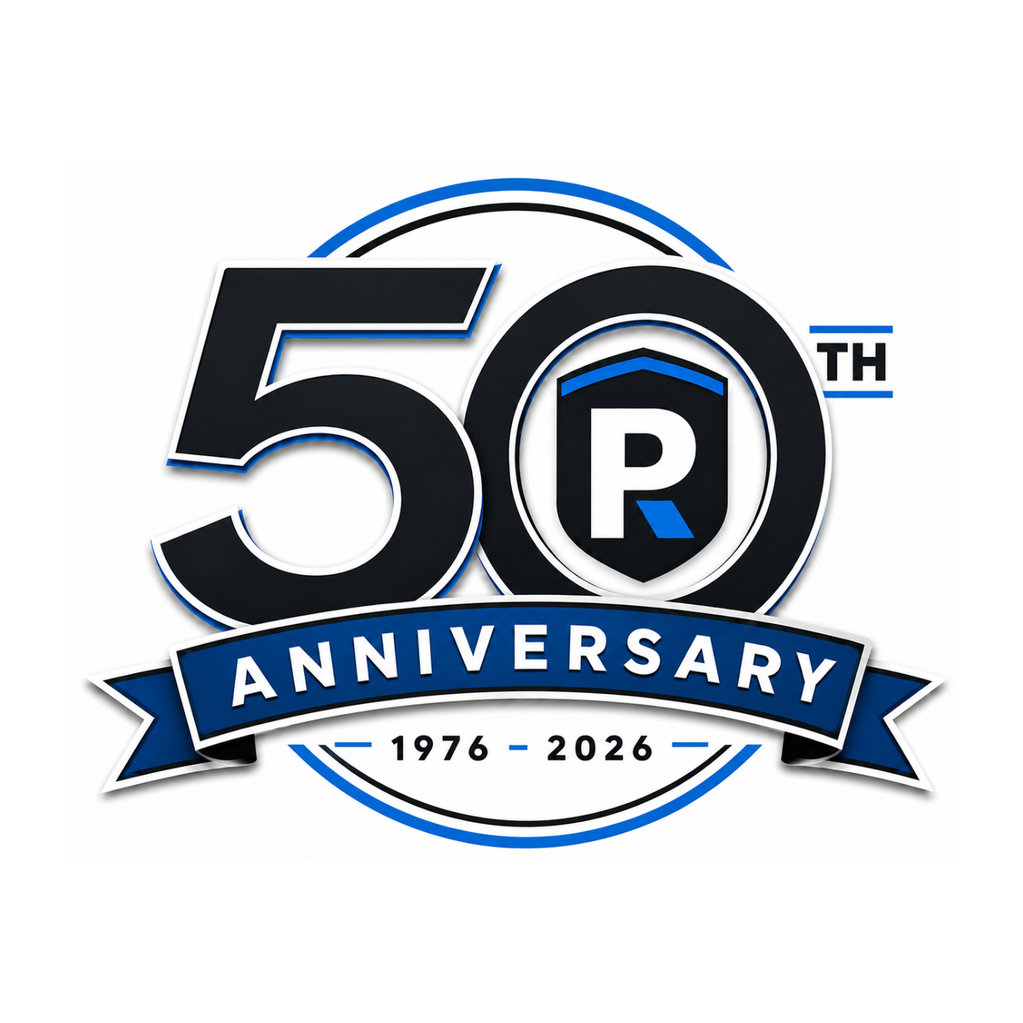
Unfortunately, they weren’t completely happy with the result – and we can see why. The colors didn’t match their established brand palette, their original logo had been altered, and the overall design felt somewhat generic. Most importantly, it didn’t incorporate the recognizable visual elements that have helped define the Performance Roofing brand over the years.
So, they came back to us to create a 50th anniversary logo that actually felt like Performance Roofing.
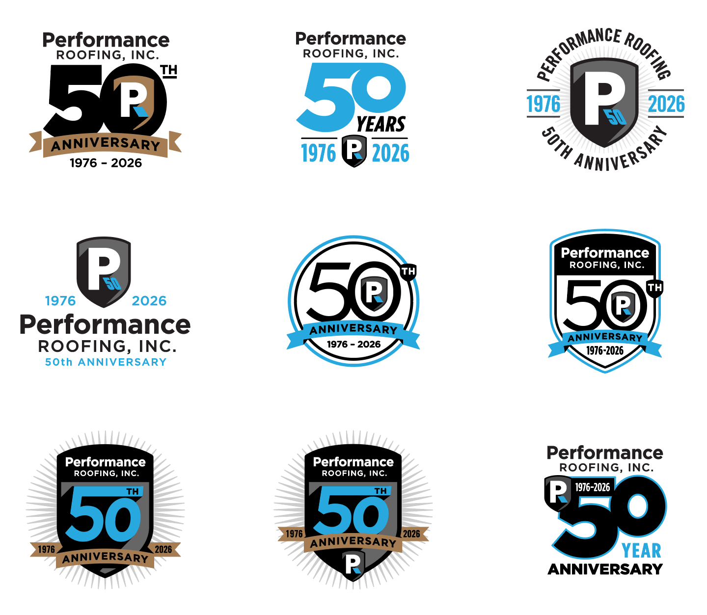
Below are our initial explorations, using the proper brand colors, logo icon, and established visual elements to create an anniversary mark that feels cohesive with the Performance Roofing brand:
Exploring the 50th Anniversary Identity
Rather than creating an anniversary logo that felt disconnected from the existing brand, we explored several directions built around Performance Roofing’s established visual identity. Each concept uses the company’s signature black, gray, white, and blue color palette while incorporating recognizable elements from the original logo – most notably the shield and stylized “PR” icon.
From there, we experimented with different ways to make the 50 the focal point. In some concepts, the existing shield becomes part of the anniversary mark itself, while others integrate the “PR” icon directly into the zero. We also explored badge-style designs, circular anniversary seals, banners, and more contemporary typographic arrangements to give the company a range of options – from traditional and commemorative to clean and modern.
Throughout the process, the goal was to celebrate the milestone without losing sight of the brand Performance Roofing has spent decades building. Even without reading the company name, many of these concepts retain enough of the original logo’s colors, shapes, and visual language to still feel distinctly Performance Roofing.
And I think there is another good design point worth mentioning: the variety is intentional. You aren’t just showing nine arbitrary versions of the same badge. You’re exploring different levels of connection to the master brand – some are essentially anniversary adaptations of the existing shield, while others allow the “50” to become a larger standalone graphic for shirts, hats, vehicles, signage, social media, etc.
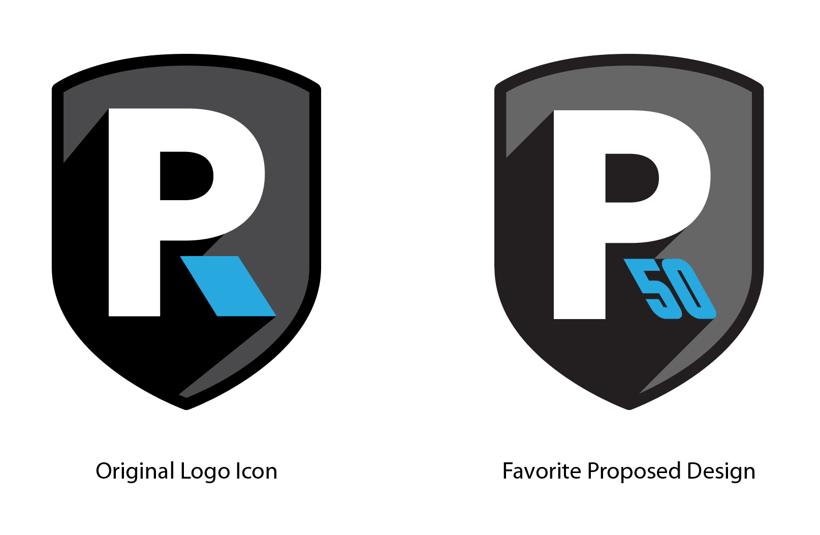
Our Favorite Option:
Of all the proposed logos, this one is our favorite. By transforming the notch in the “R” into a “50,” the design stays true to the original logo while making the anniversary feel like a natural extension of the brand. The placement also gives the “50” the appearance of shooting out from the logo, adding a subtle sense of energy and movement. Super simple, clean, and effective.
Celebrating a Milestone? Make It Part of Your Brand.
A company anniversary is more than just a number – it’s an opportunity to celebrate your history while reinforcing the brand you’ve worked hard to build. Whether you’re celebrating 10, 25, 50, or 100 years, Visual Lure can create a custom anniversary logo that complements your existing identity and feels like a natural extension of your brand.
Have a milestone coming up? Contact Visual Lure to create an anniversary logo worth celebrating.
