OUR BLOG

Here you will find our latest works, company news and more. We update it on a regular basis so be sure to come back soon. Please like, share, pin or tweet the post you enjoy.

Package Design for Supplement Freeze Pops

Posted on October 14, 2016

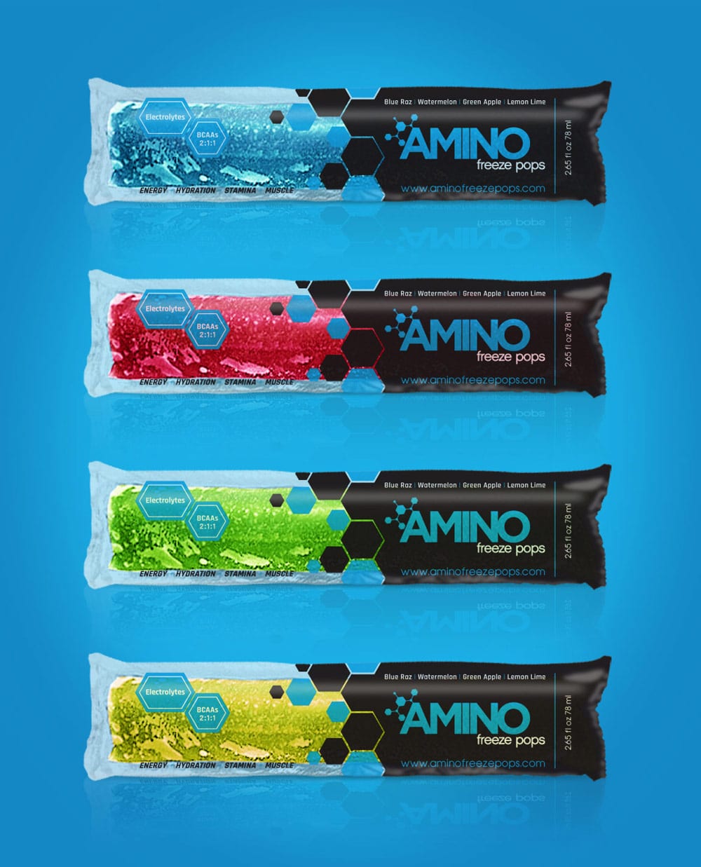
Visual Lure recently completed new packaging design for Amino Freeze Pops. Amino Freeze Pops are frozen treats for adult athletes and body builder that are packed with Electrolytes and BCAAs. Essentially, it is a frozen post-workout recovery drink. They provide a boost of energy, help with hydration, can increase stamina and aid in building muscle.

The old design featured icicle shapes that didn’t quite complement the logo/brand, and their attempt to visually highlight the Electrolytes and BCAAs fell short. The new design is much more cohesive and polished. Learn more about Amino at www.aminofreezepops.com.

The Power of a Hashtag

Are you using #hashtags in your social media strategy? If not, you should be, because you never know who will find you when you do. Landing this project is a great example of the power of a hashtag. Here’s the story: We recently completed new packaging design for 2nd Impact, a new supplement company based out of St. Louis, MO. We had just finished some of their designs and we posted them on our Visual Lure Instagram account. When we posted the images, we used the following hashtags: #PackagingDesign, #PackageDesign, #SupplementLabelDesign and #SupplementBrand. Within 30 minutes Amino Freeze Pops had followed us on Instagram, and we were having a conversation over the phone. We think that’s both crazy and amazing! A company based out of Boynton Beach, Florida, aย company we would never have run into, is now a client all due to a hashtag.

Amino Freeze Pops Packaging

Our Packaging Design Services

Learn more about our package design services, or click here to view our packaging design portfolio ยป


Logo & Branding Package for Quebec Photography Studio

Posted on September 1, 2015

Studios Elysium Photographie is a Rigaud, Quebec based wedding and portrait studio offering wedding, family and glamour photography in the Vaudreuil, Montreal and eastern Ontario area. They recently came to Visual Lure to create a new visual identity. They requested that we incorporate a dragonfly into the logo as it has a special meaning to this husband and wife photography team. We did so by making it form the letter ‘t” in Studios.

Below you can see the vertical and horizontal logo formats, the sample identity/letterhead system, proposed packaging and a sample watermark. At the very bottom are two unselected logos that we really liked. The bottom right logo was a fleur de lis that also created a dragonfly. We thought this one was genius, but after speaking to the clients, they informed me that it would be controversial using a French symbol in their logo. I guess there is a dispute whether Quebec should be politically aligned and influenced by France. They didn’t tell me which they preferred, simply that they didn’t want their business logo to be controversial.

Studios Elysium logo design branding

Photography Logo Design & Visual Branding Package for Connecticut Wedding Photographer

Posted on April 30, 2015

Nick Benson, a very talented wedding photographer from Monroe, CT, recently came to Visual Lure for a rebrand. During the discovery stages, Nick was consistently referring to one of his wife’s favorite brands, Tory Burch. They both loved the look and feel of the brand and its popular monogram icon.

Inspired by the embellished block serif of the Tory Burch logo, we started sketching similar custom N’s and B’s. That’s when we came across a pleasant little surprise. While drawing a custom letter N, we discovered we could hide a very subtle B in the negative space of the N, similar to how the FedEx logo has the hidden arrow in between the E and the X. It may take a second or two to see it, but once you do, you always will.

At that point we quit sketching as we knew this would be the final mark. We usually provide anywhere from four to eight initial logo options, but for this one, it was the only option we presented to our client. Nick still wanted to see what else I had done but quickly agreed that this logo was it.

Below you can see Nick’s new logo in all its glory with additional format options, one with a shiny golden brass effect added to it along with some sample packaging. We think this mark feels very high-end and screams luxury, two of the main traits our client wanted his new logo to feel.

Nick Benson Photography Branding Package


View more of our photography logos & branding projects ยป


Laundry Detergent Package Design for St. Louis Area Manufacturer

Posted on April 27, 2015

Stellar Manufacturing recently contracted Visual Lure to spruce up a couple labels for their new line of laundry detergent. The store buyer, the person in charge of selecting what products will go in a store, turned down the initial labels that were designed by another graphic designer. Stellar came to us to develop package designs that the buyer wouldn’t say no to, and we did just that. With only one minor round of revisions, the buyer accepted our designs.

The moral of this story is to hire and invest in a good package designer the first time around. Subpar package design is one of the main reasons products get turned down by buyers. Having visual pleasing, eye-catching packaging is critical in the success of a product. With all the other products on the shelf, yours needs to stand out, look professionally designed and give buyers an immediate sense of trust.

Below are the before and afters of the first two scents in Stellar’s new line of Bright House Laundry Detergents, Fresh Scent and Lavender.

BH-BfrAtr-package-design

…and here are our original designs, which we still feel are stronger:

BHLDFS-package-design

BHLDLS-package-design

Contact Visual Lure today at 618.407.9231 for a FREE package design quote. We would love to help you get your products past the store buyer and onto shelves.

Logo Design & Branding for a Pennsylvania Photographer

Posted on April 20, 2015

We had the pleasure of meeting Pam Baumann at this years Shutterfest. Pam is a professional photographer based out of Limerick, Pennsylvania. She originally started out as a nature photographer and is now focusing more on family and individual portraiture. When we met Pam she had no idea what she wanted her brand to look like. Since we were in the trade show area, I decided to start helping her define her brand by visiting the Photo Flash Drive booth. I asked her what style of zip drive or box was she drawn to. She walked right past the modern crystal drive, and the high-fashion alligator skinned boxes and went immediately towards the premium wood packaging. This was the start of defining her brand. We then discussed what large named brands have an aesthetic that she gravitates towards but she couldn’t think of any. As we walked through the trade show we were discussing the booth designs, that’s when she saw one she really loved. I can’t recall the name of the company, but the booth used worn corrugated metal, reclaimed wood, earth tones and had a very rustic look and feel, yet it still felt inviting and warm. She instantly said that was the direction she wanted to go. Once I saw that booth it reminded me of Timberland, the boot company, so I mentioned that brand to her and she agreed that it had elements she liked.

From there, we discussed what type of logo she wanted, a type-based logo, a monogram, a crest of some kind or one with an icon. Without hesitation Pam said she wanted an icon. We then talked about what the icon could be, as the best ones have some type of meaning behind them. The conversation started with Pam possibly wanting to use hills, a sunset with trees, etc. but I told her icons need to be simple. It then went into possibly using a camera aperture or shutter, which I hate to use unless it is incorporated in a clever and memorable way. We despise photography logos that use generic cameras or shutters, they feel so impersonal and cliche.

This led us to the discussion of possibly using a tree which is a great symbol for family. We talked about using a tree with her initials hidden in the branches, but she was not sold. The conversation then moved into using a leaf or leaves. By this time Pam’s visual brand was pretty well defined. It was natural, rustic and colorful yet warm. That is when it hit me, using leaves to create an camera aperture. I drew a quick sketch and Pam was instantly sold. My first concern was has it been done before, I searched a couple of the largest logo databases along with Google Images and found nothing. This made us both extremely happy.

Below in Pam’s new logo along with the beginning stages of her visual branding package, including sample identity, flash drive packaging, typefaces and color palettes.

Pam-Baumann-logo-branding

Do you need help defining your brand and implementing a full identity package to match? Give Visual Lure a call today at 618-407-9231, we would love to help you find your brand.

Click here to view more of our photography logos and branding packages ยป


Niche Photography Website Launch, Branding Package Update & Brochure Design

Posted on January 21, 2015

Visual Lure recently launched a new website for Niche Photography. Niche Photography is a St. Louis area wedding photographer specializing in portrait, baby and high school senior photography. They are located in Mascoutah, IL and service the entire St. Louis and St. Louis metro east area. In addition to their new website, we updated their identity package and designed a new pricing brochure for them.

The new website was built using a fully custom designed, search engine friendly, responsive WordPress theme with aย multitude of cool effects. The new site features a “sticky” menu that always stays at the top of the page. The logo mark elegantly fades away allowing the menu bar to use less vertical space. Other features include an easily maintainable home page slideshow, a unique rollover-effect for recent post on the home page, and masonry style responsive galleries. Click here to visit Niche’s new website.

We also updated Niche’s visual branding package by switching his logo to all grey (the logo mark was originally a Tiffany’s colored teal blue). Niche felt this switch made the brand more neutral or moreย appealing to the masses.

We wrapped up all these upgrades with an engagement and wedding pricing brochure. They will hand these out to potential bride and grooms at local bridal shows.

Niche Photography Branding & Website

Update: We recently received printed samples of the new brochure and had a chance to photograph them. They turned out fantastic!

niche-brochure-design1

niche-brochure-design2

View more of our photography logos and branding packages ยป


Complete Branding Package for a Pittsburgh Photography Studio

Posted on December 18, 2014

We recently wrapped up a complete visual branding package for Wright Image Photography, a Pittsburgh area family and wedding photography studio. We actually started with their logo and website last year and just completed the letterhead system, packaging and wedding brochure. The new pieces will utilize specialty printing with the logo being gold foil stamped on the letterhead, paper bags and wedding brochure.

Sticking with the white and gold color theme, we selected a crystal flash drive with a gold cap from photoflashdrive.com and we found brass metal business cards at mymetalbusinesscard.com (that look gold). These will we be used for the labels on their large prints and canvases – which will be wrapped in white craft paper and a white ribbon. As mentioned before, the bag will have a gold foil stamped logo, and patterned or solid metallic gold tissue paper will top it off.

Due to the custom search engine optimized WordPress website we created for them last year, they have more than doubled their weddings for next (all without any additional marketing). This bump in income has allowed them to reinvest in the company and they are now working on creating a solid marketing plan for next year. We are also currently converting their existing website to be responsive to improve traffic, lower the bounce rate and provide a better overall user experience.

It is always a pleasure to work with clients that understand and value the power of good design and cohesive visual branding. If you are one of those people, give us a call today, we would love to help take your business to the next level.

wright photography branding package

Update: Printed samples of the new brochure and identity design package just came in. They printed beautifully!

wright-identity-design2

wright-identity-design1

wright-brochure-design2

wright-brochure-design1

View more of our photography logos and branding packages ยป